Football

England have overcome a unwanted 24-year record which can only help them in their aim of winning the World Cup.
Brendan McGilligan
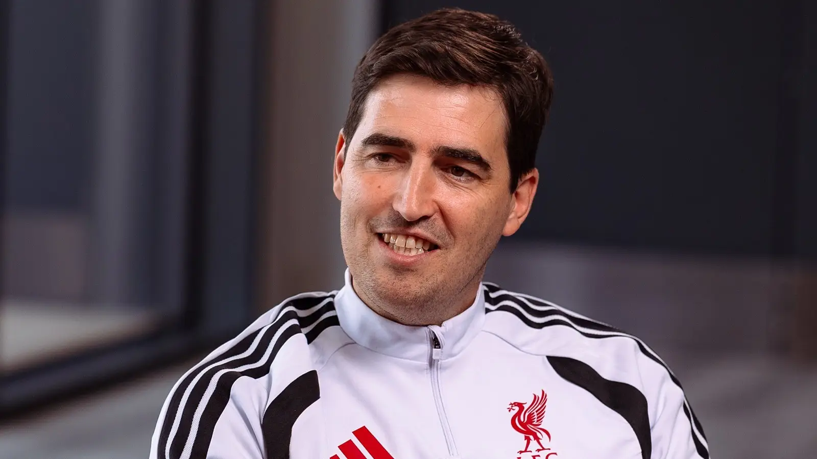
Andoni Iraola has made a big move for his first transfer as Liverpool boss.

Ben McCrum

An England player has been spotted limping off the pitch in the victory over Croatia leading to injury concerns.
Brendan McGilligan

Thierry Henry has expertly broken down the reason behind Cristiano Ronaldo's struggles for Portugal in the World Cup so far.
Brendan McGilligan