Premier League's best away kit scores 9/10 as one club's 'crazy' design slammed

After a breathtaking World Cup tournament in North America, the new Premier League season is almost upon us and teams will be returning the top flight on the weekend commencing 21 August.
A new season means new players and plenty of new managers - with a whole host of coaching changes going into the 2026/27 campaign.
But of course most importantly it means new kits for all 20 clubs competing in the English top tier. After delving into the home shirts, SPORTbible has followed suit with the away jerseys - where clubs and its manufacturers are known to be a little more adventurous.
Here are our rankings, which will no doubt split opinions.
AFC Bournemouth
Rating: 5/10
Advert
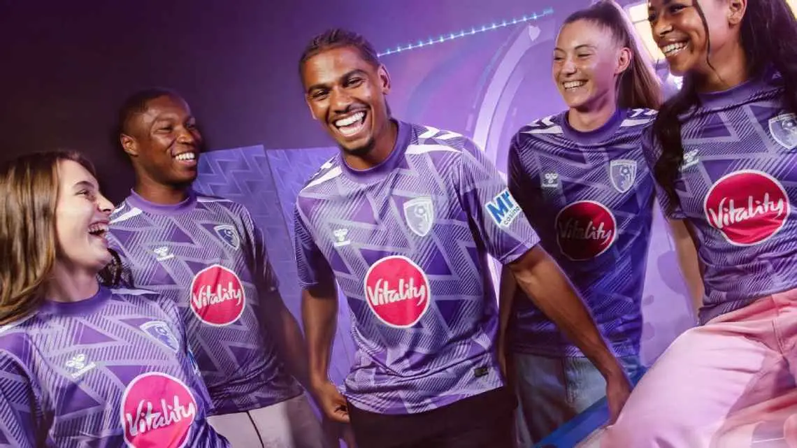
Bournemouth are definitely going to be standing out away from home in domestic and European competition with their new purple number. The design is a remake of a previous zig-zag away kit in the early 1990s but is slightly ruined by the big Vitality logo as sponsor.
Arsenal
Rating: 8/10
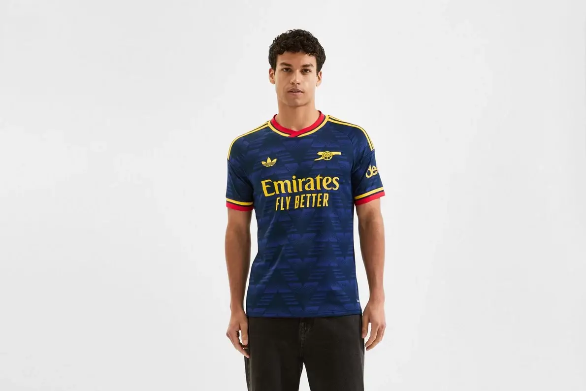
Arsenal and Adidas away kits are just a match made in heaven. For the coming season, Arsenal's away kit again has the classic bruised banana pattern but is blue with yellow and red on the three stripes.
Throw in the Adidas originals logo and the Arsenal cannon and you have a gem of a shirt.
Aston Villa
Rating: 8/10
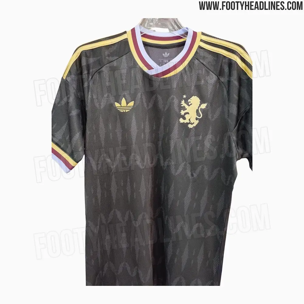
Sticking with Adidas, Aston Villa also look to have a belter of an away kit for the new season. While it has not been officially released, leaked images from the reluable Footy Headlines show a slick black shirt that has a gold trim and hints of claret and blue.
The details are strong and it's a classy, retro-looking shirt.
Brentford
Rating: 7/10
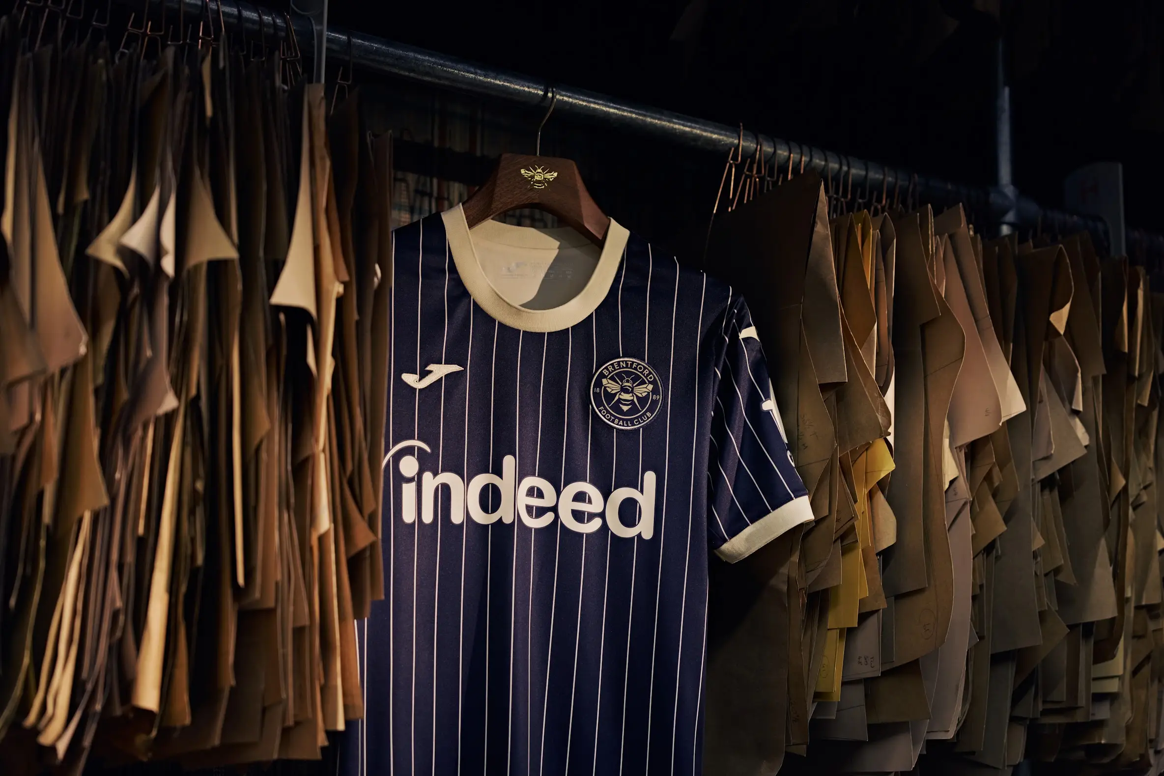
The solid shirts keep on coming. Brentford's new away strip is inspired by the 'Kingsman' film franchise after director Matthew Vaughn became a minority shareholder.
Out now, the navy and cream pin-striped design is a nod to the film and its impeccable tailoring at the Savile Row secret base in the films.
However, we must admit that the new 'Indeed' sponsor does have a very Bundesliga feel to it.
Brighton & Hove Albion
Rating: 5/10
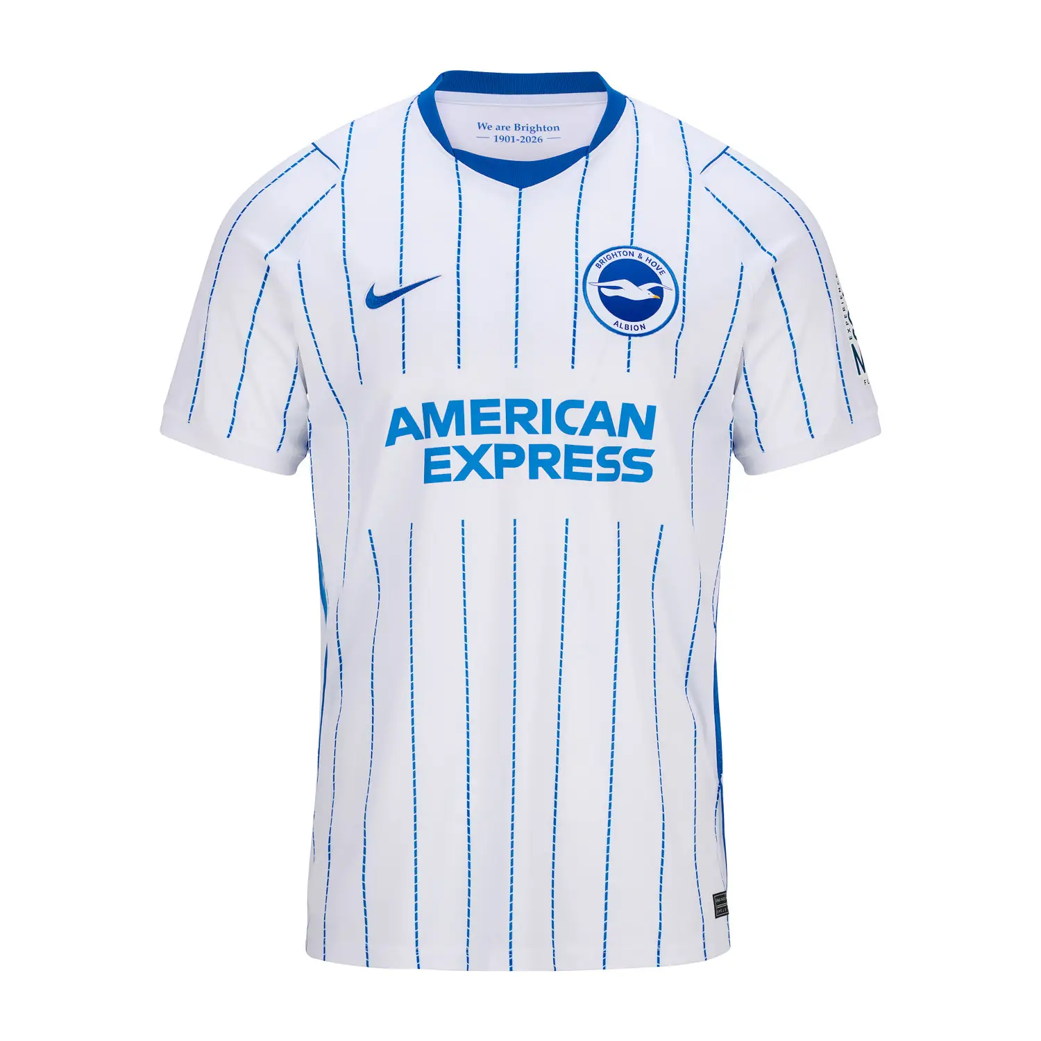
It's not bad but you get the feeling that not too much creativity has gone into it. It is basically a reverse of the Brighton home strip and therefore doesn't score well.
Chelsea
Rating: 4/10
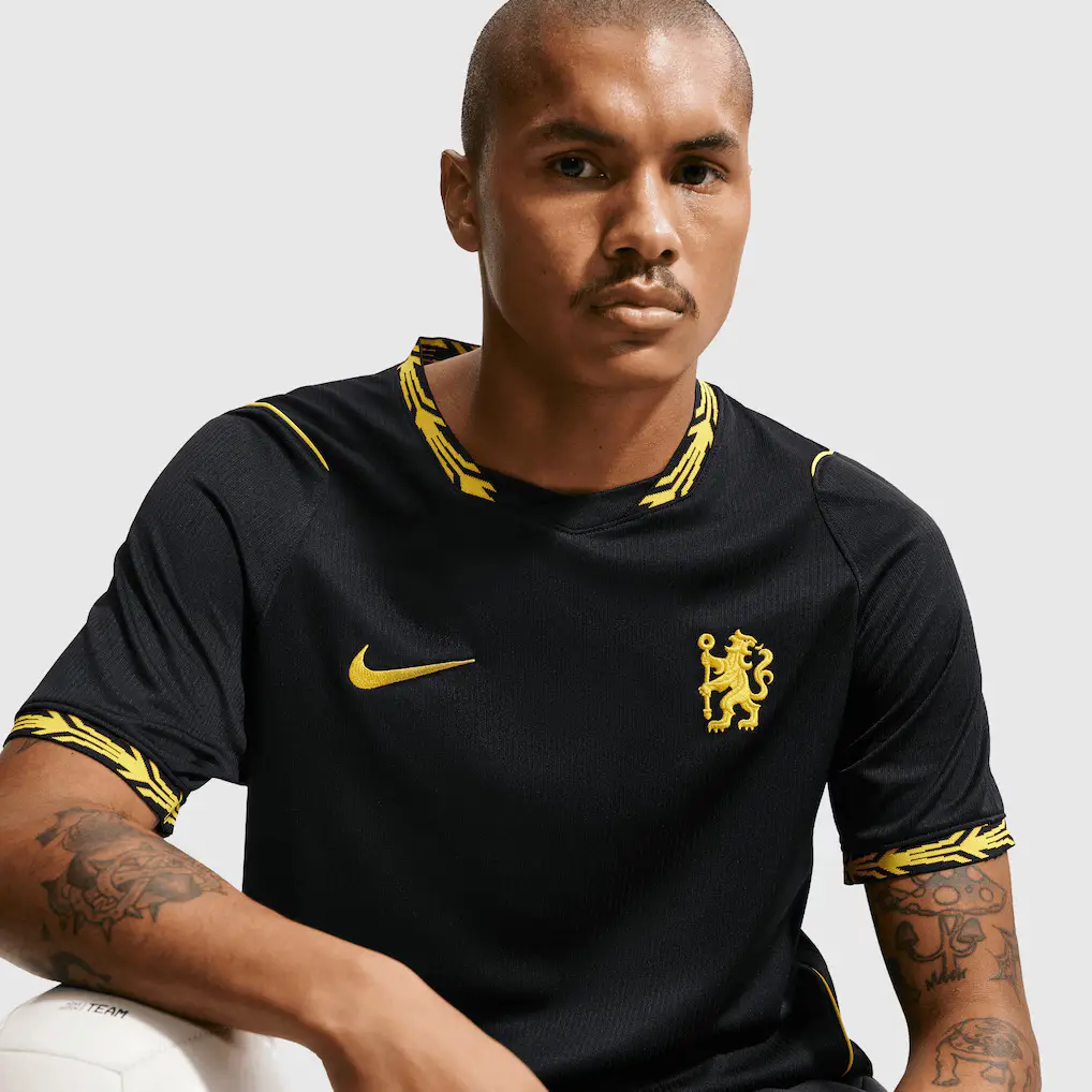
You can't really go wrong with a black shirt but this Chelsea one just doesn't look great. Like the home shirt, there is the impressive-looking Lion crest but the laurel wreath motif bordering around the neck and sleeves doesn't do much.
Coventry City
Rating: 6/10
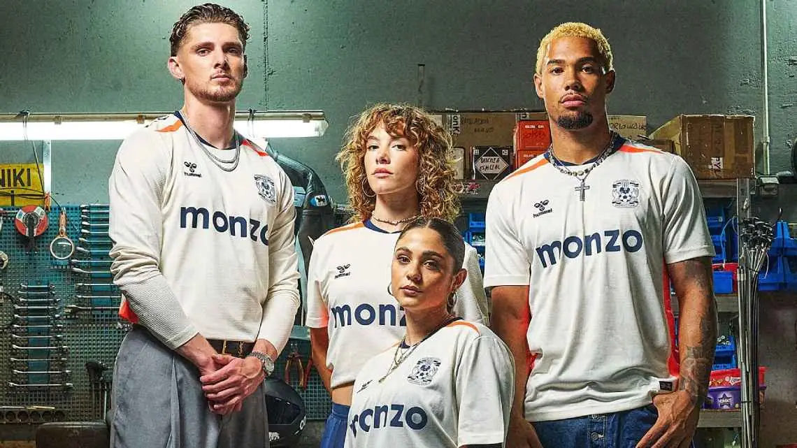
A steady shirt for the trips away from home, with a predominantly off-white colour mixed with hints of orange and blue. It does the job.
Crystal Palace
Rating: 5/10
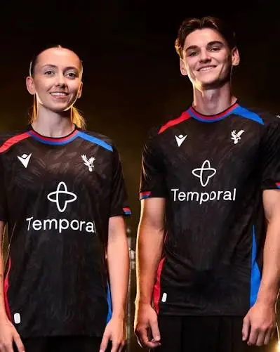
While not being big into conspiracies, it does feel like Crystal Palace have had this exact same design before. They have changed things up by bringing back the sash in a classic home remake but the away shirt doesn't bring much to the table. We're not having the sponsor either.
Everton
Rating: 6/10
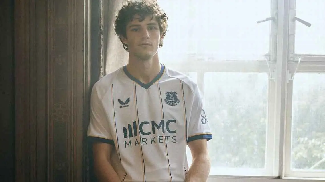
In the nicest way possible, this kit really does suit Everton. It's a hark back to a rare design the Toffees wore back in the 1950s and it could be a real hit. The blend of colours are nice with the white, amber and blue. Kudos to Castore.
Fulham
Rating: 7/10
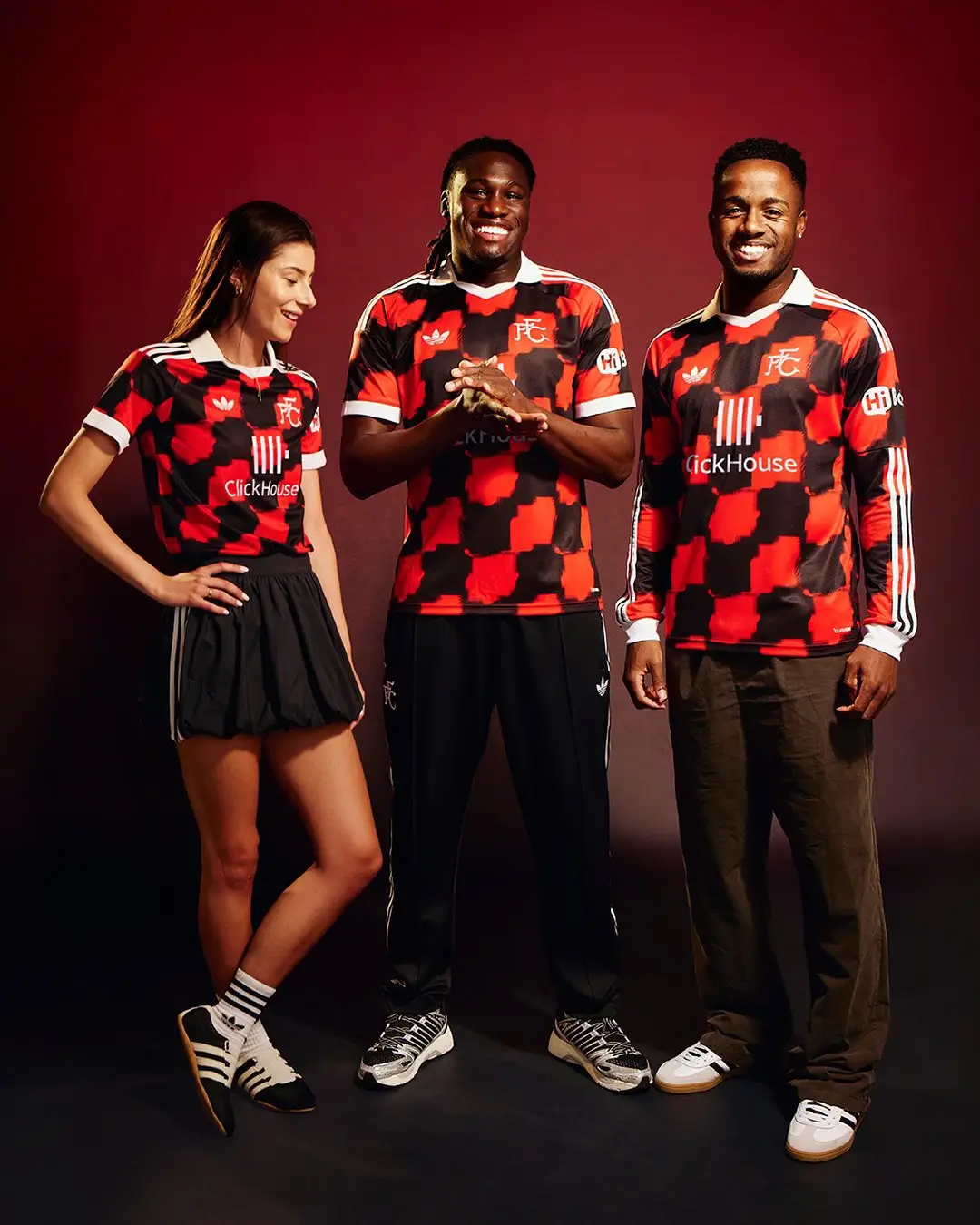
A beauty of an away strip, which sees Fulham look set to take a trip to the 1996/97 with a red and black chequered design. The sponsor is a bit of a stinker but the shirt gives off serious Flamengo vibes and is undoubtedly one of the best int he 2026/27 season.
Hull City
Rating: 7/10
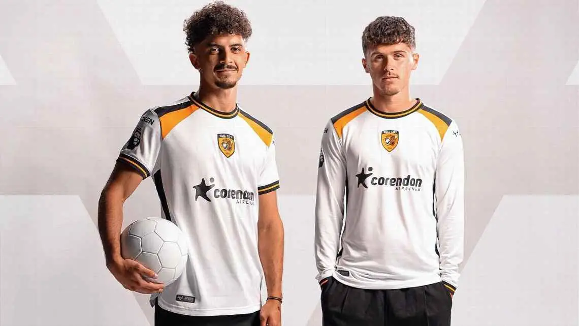
A strong return to the Premier League for the Tigers, who have a very a classy white away shirt that serves a throwback to a 1988/90 jersey. A centre badge and the nice hints of yellow and black, we're all for it.
Ipswich Town
Rating: 5/10
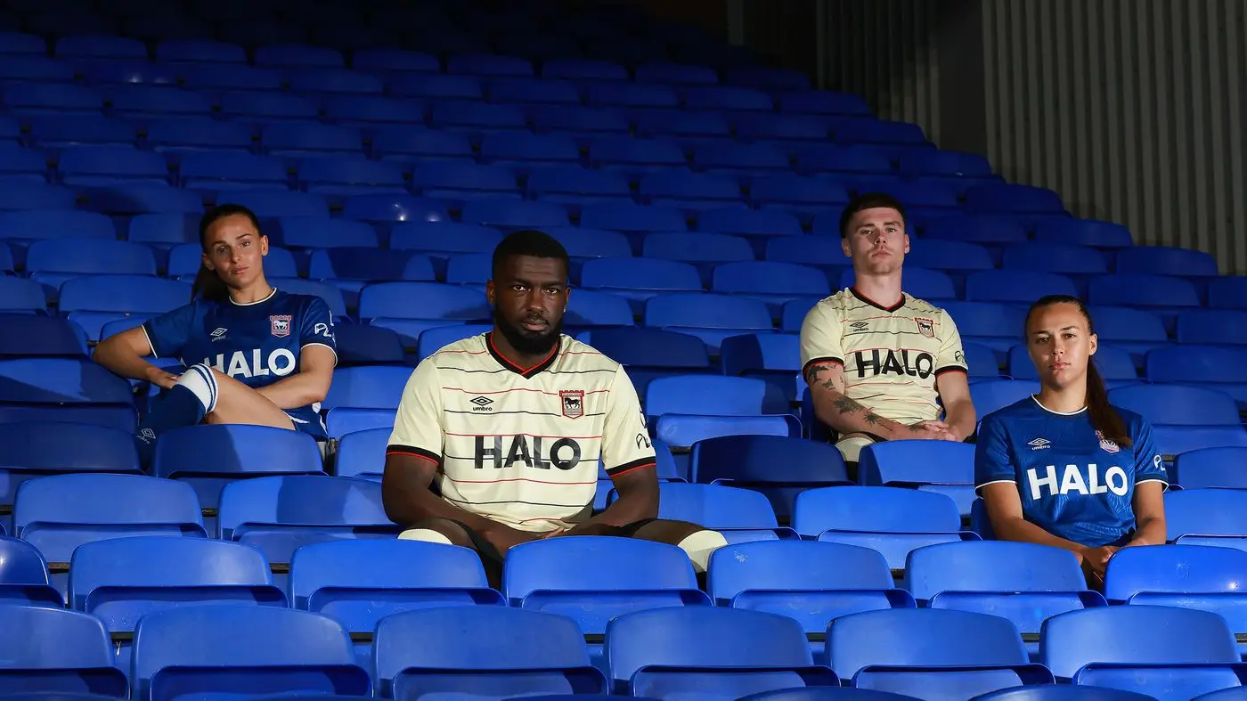
There's a lot to like about the shirt, from the collar to the cream colour - which follows on from a design sported between 1996 and 1998. However, we can't help but feel that it doesn't quite work.
Leeds United
Rating: 9/10
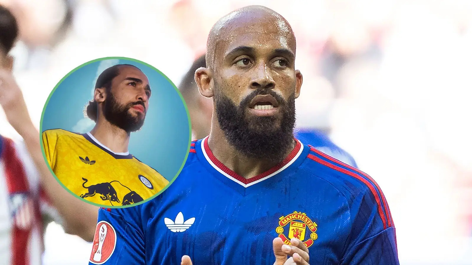
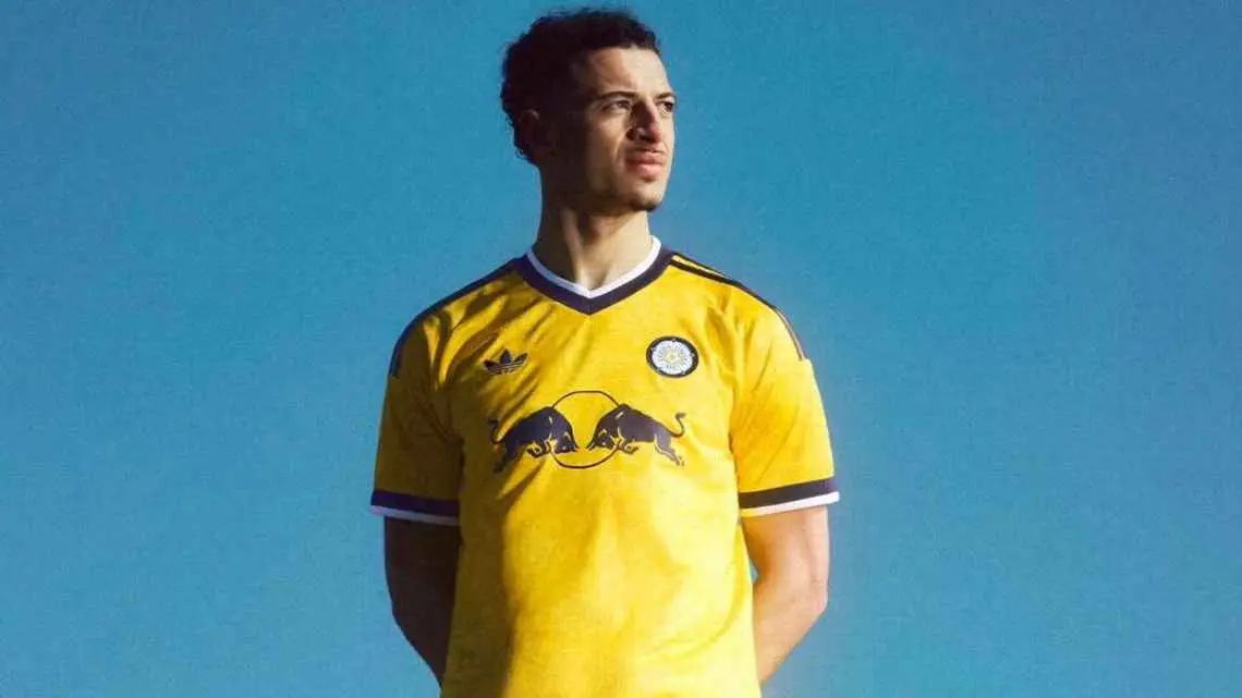
It might just be the best away kit of the 2026/27 season. A gorgeous yellow number from Leeds, accentuated by the Adidas originals logo, retro club badge and Yorkshire rose pattern, makes this one of the top shirts.
The navy and white trim goes perfectly and even the Red Bull logo compliments it very well. It's that good, Leeds fans ought to wear it on nights out.
Liverpool
Rating: 6/10
A typical Liverpool away shirt under Adidas. It's nice and clean if not overly spectacular and looks like a strip Andoni Iraola's men should be wearing.

Manchester City
Rating: 8/10
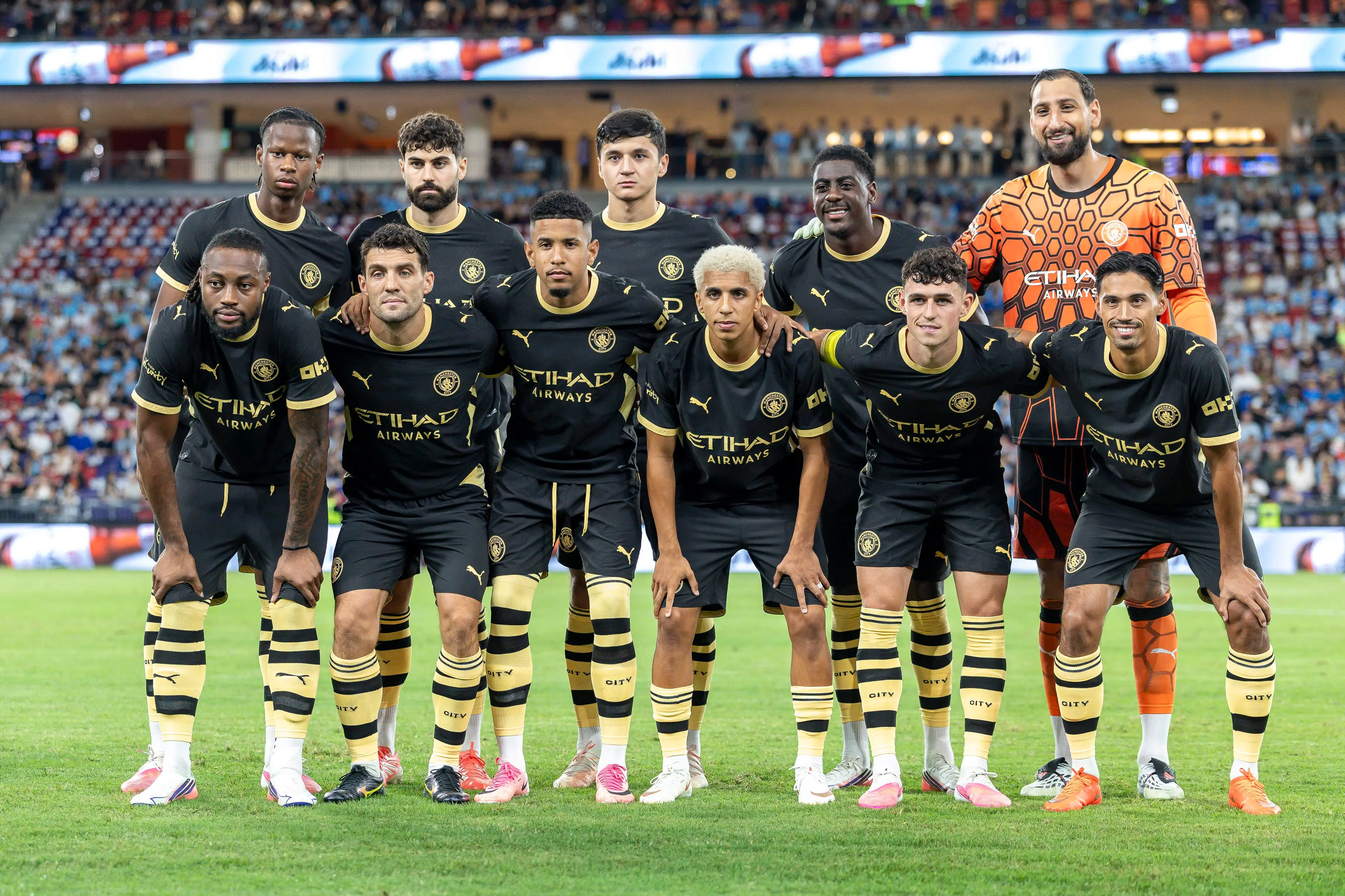
City like to pay tribute to the local history in Manchester in their change strips and they have done that again with a kit that is based all around the worker bee symbol that dates back to the 'Industrial Revolution'.
There is a bee pattern all over and the black and yellow colourway works wonderfully for a smart Puma creation.
Manchester United
Rating: 8/10
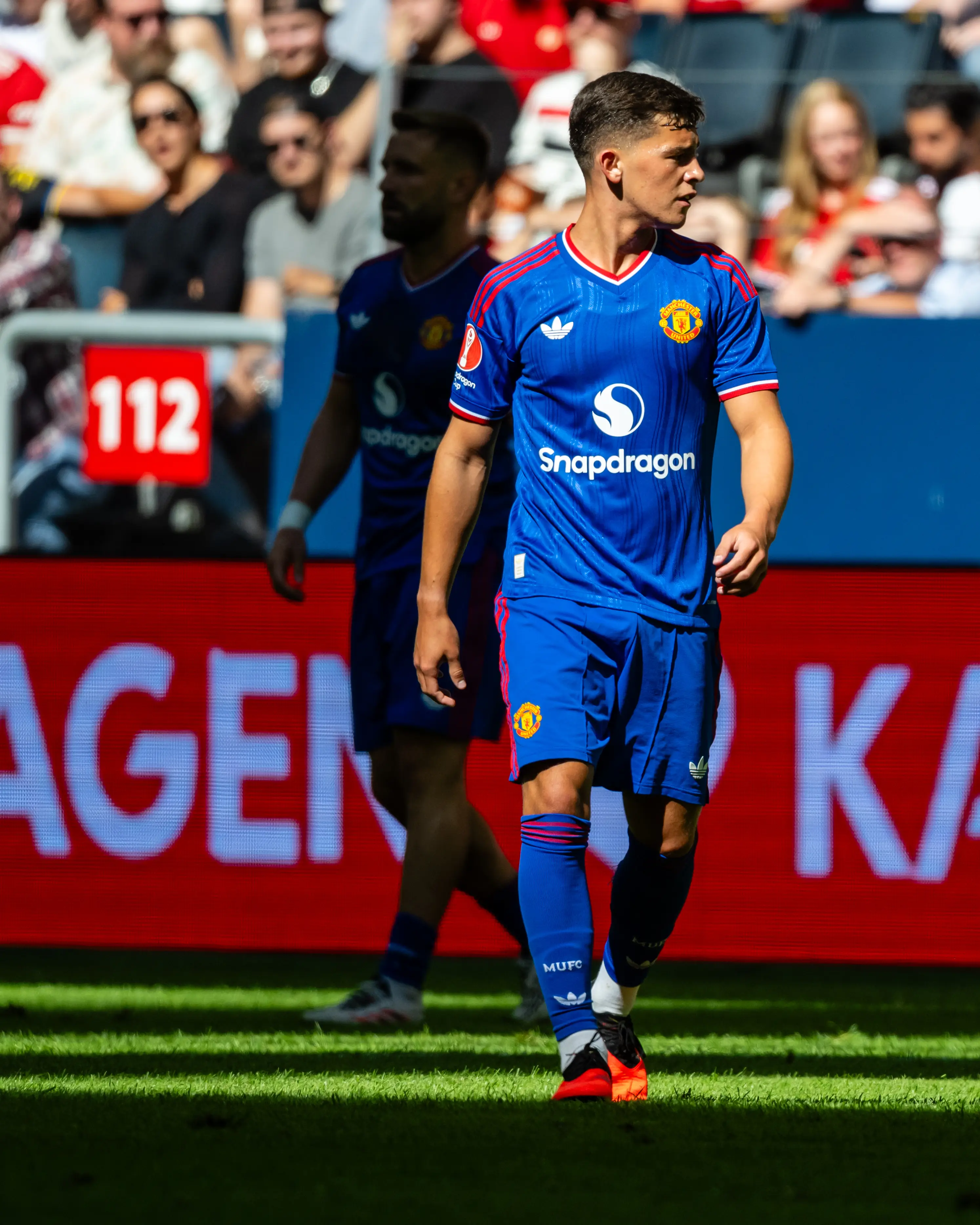
It just works. United, Adidas originals and blue with hints of red is the archetypal away kit for the Red Devils and it's already proving to be a major hit. Another shirt which is perfectly acceptable to wear no matter what the activity.
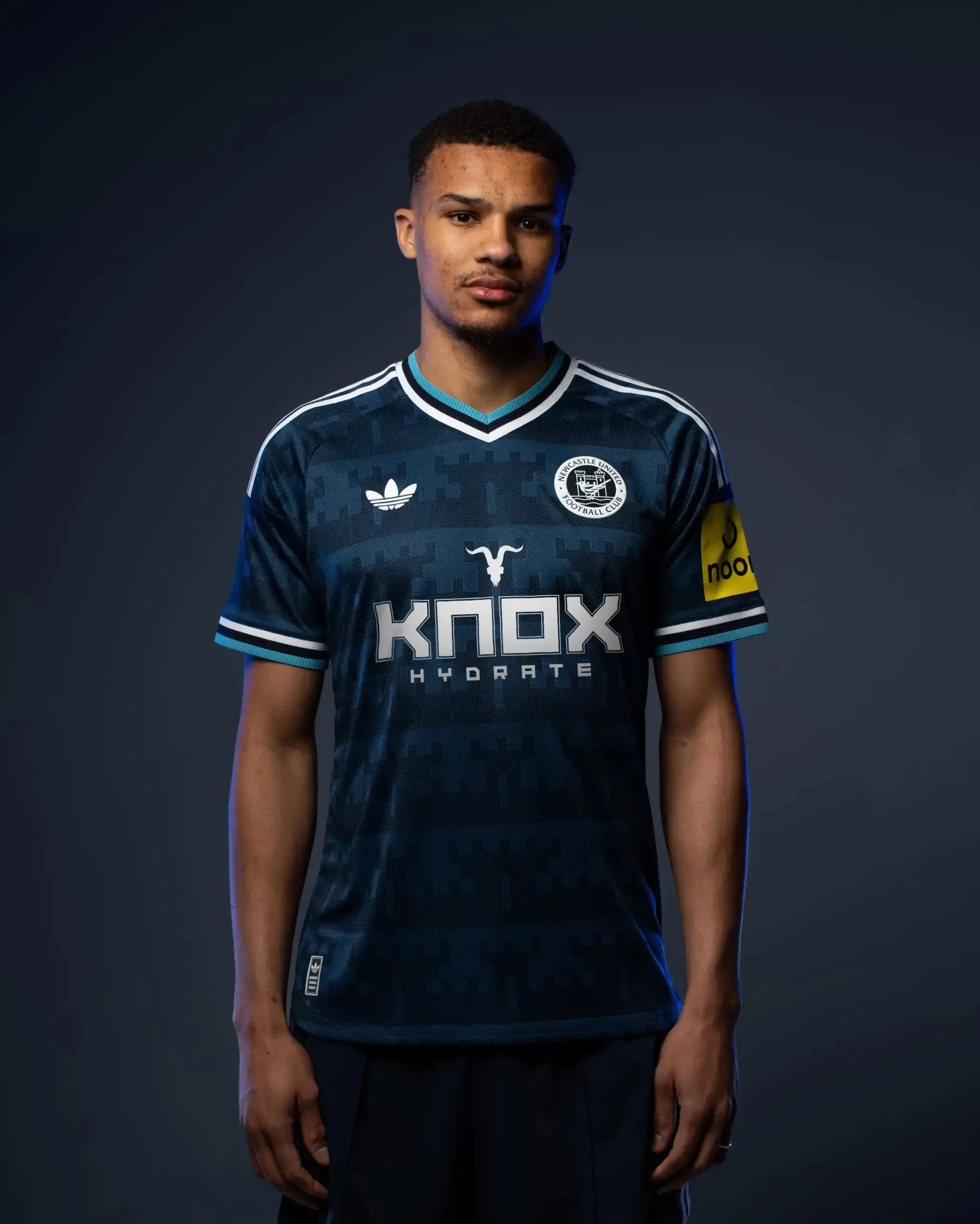
Newcastle United
Rating: 6/10
While the home shirt is an absolute abomination, there's a lot more to like about the away shirt. It has a nice mix of colours to it and the badge in particular really stands out. It's just a shame about the ugly sponsor.
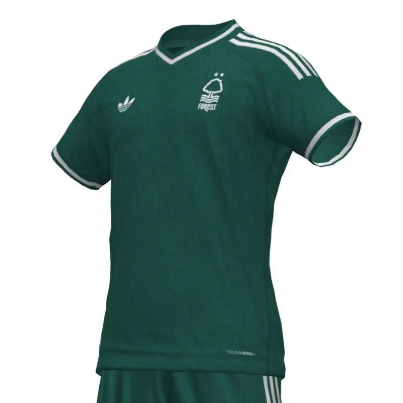
Nottingham Forest
Rating: 4/10
Forest's away strip hasn't been released yet and so we're having to rely on leaks from Footy Headlines again. And while it may not look as it does in the below images, we can't say it's doing much for us. It looks like a bit of an old Liverpool strip about it.
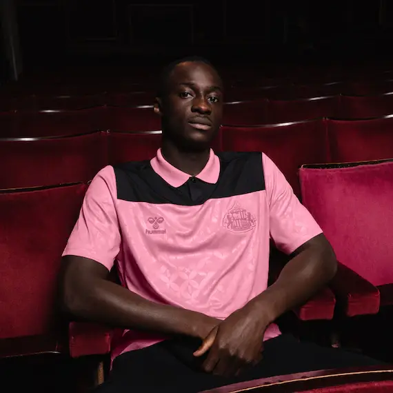
Sunderland
Rating: 7/10
If you're all about pink kits than Sunderland have the shirt just for you. Genuinely, the club have collaborated with Elvis Pressley for their Hummel away shirt, which is pink and serves as a tribute to a suit he famously sported in an appearance on the 'Louisiana Hayride' TV show back in 1954.
The Elvis link-up stems from Sunderland fans singing 'Can't Help Falling In Love' as a pre-match anthem.
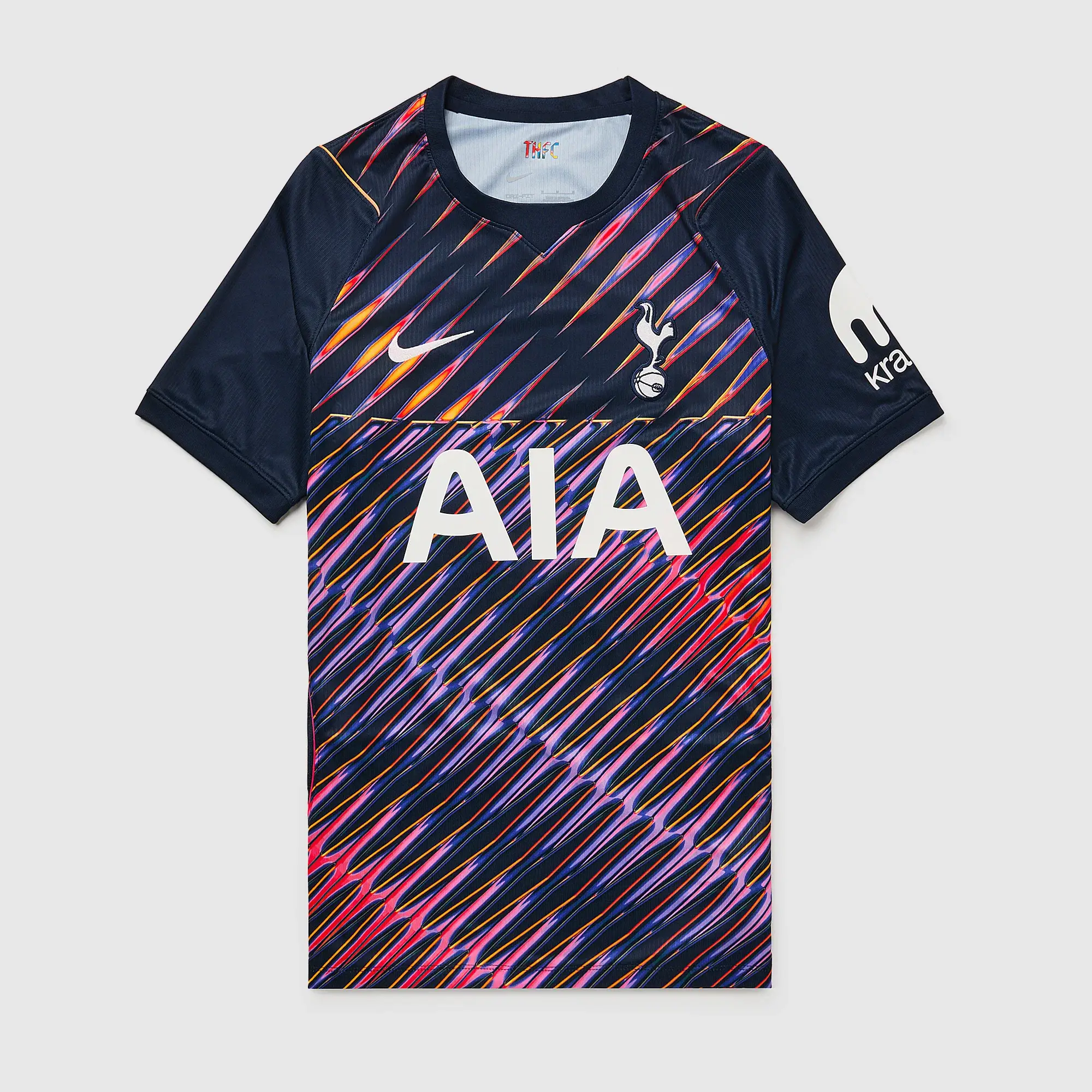
Tottenham Hotspur
Rating: 2/10
It has to be the worst away kit of all 20 Premier League clubs this season. It looks like a goalkeeper kit with its crazy, colourful pattern and there's not much else one can say.
Topics: Premier League
 Josh Lawless