
Why Man Utd have been forced to make major change to their new kit for Champions League games

To comply with UEFA rules, Manchester United must make a noticeable change to their new 'three-pronged' third kit when playing in this season's Champions League.
United recently unveiled their new third kit for the 2026-27 campaign, a design that serves as an ode to Mancunian youth culture, local identity and community endeavours, according to the club.
As seen in the picture below, the unique shirt has a cream-coloured base with dark green and red accents, centralised badges and a floral wrap across the base of the much-talked-about jersey.
The standout addition is most definitely the crest and Snapdragon logo being centralised, a unique look that has received widespread praise amongst fans.
Advert
However, while the jersey will be worn in domestic competition this term, UEFA rules mean that the 'Snapdragon' wordmark will be added to shirts for any Champions League matches it is worn in.
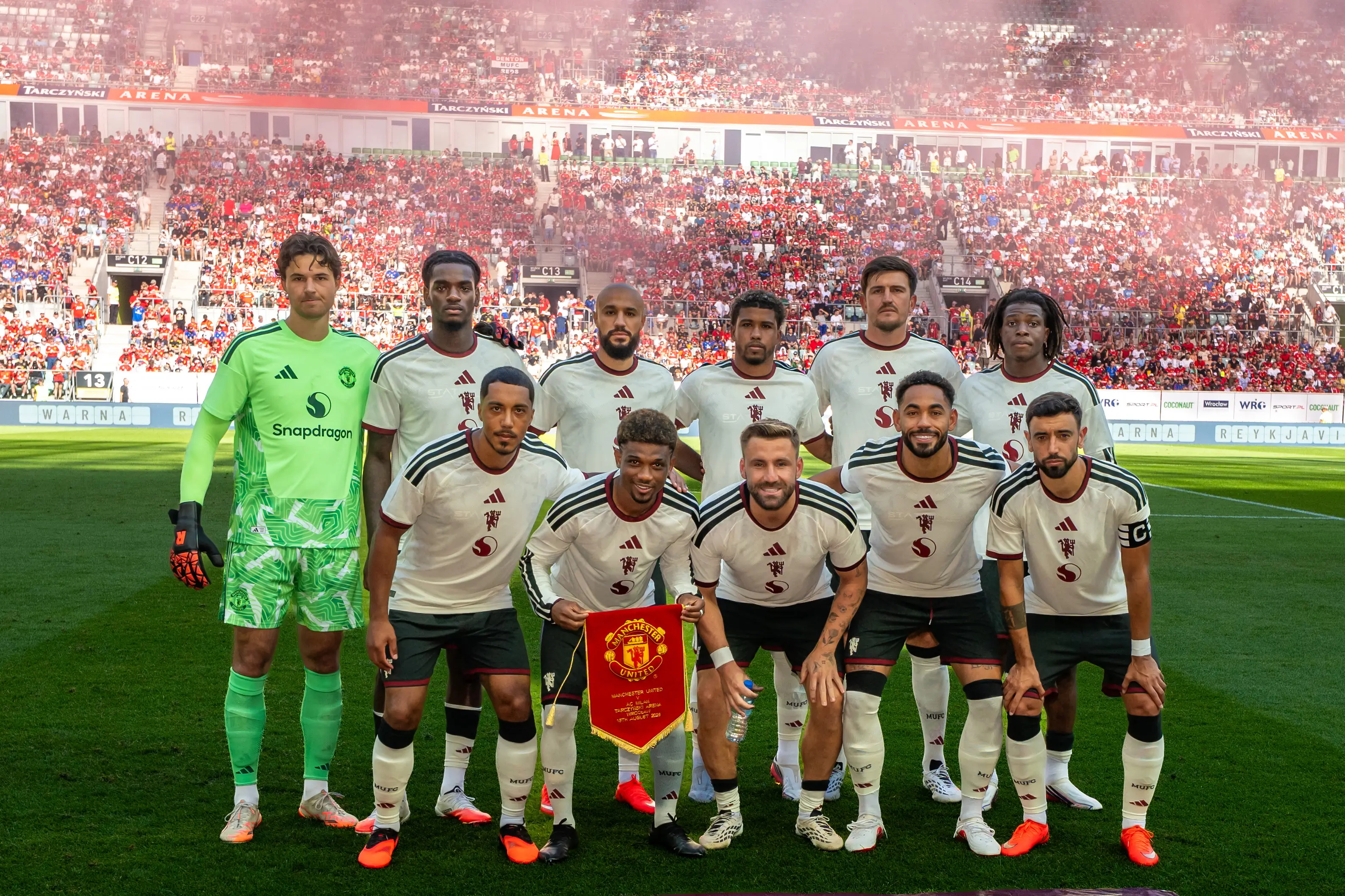
As per UEFA's guidelines, the same version of a logo must be used across all of a club's kits in the tournament, meaning the sponsor on the third strip needs to match that on United's home and away releases, which feature the wordmark.
The meaning behind Manchester United's new third kit
Earlier this month, Adidas design director Inigo Turner gave an insight into the design of the kit, which was worn for the first time during United's recent pre-season clash against AC Milan in Poland.
"Now, there's a story behind those [colours] too," he said on Inside Carrington. "They're not just there randomly. Around Manchester, you see it a lot with the architecture of the city, the old buildings, the red brick.
"So the red brick is a direct reference to the dark red [accents on the shirt]. And then often on these buildings, so like, you know, walk around the city centre, the Peveril of the Peak, and all of these very famous landmarks we like to visit.
"[The green stripes] represent the green pipes and things, and windowsills, and ledges [found on these landmarks]."
READ MORE: Every Premier League 26/27 home shirt rated as two clubs score perfect 10/10s
A building that formed part of the inspiration for the colour choice is the famous Salford Lads and Girls Club, a youth club that's helped generations of children by offering activities such as sport and music.
"The colour palette is really inspired by the geographical location, but the story here is about youth and a lot of the youth institutions from Manchester," added Turner.
"So for over 100 years have been youth institutions, principally supporting like the working class communities within the city. These are synonymous with Manchester and we lean into that."
Topics: Man Utd, Champions League
 Jack Kenmare