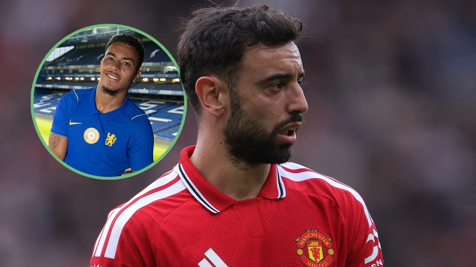
Every Premier League 26/27 home shirt rated as two clubs score perfect 10/10s

To buy or not to buy, that is the question.
As we approach the start of the Premier League campaign, plenty of supporters will be looking into whether they should purchase their new home shirt for the much-anticipated 2026-27 season.
The majority of clubs launched their jersey in late May/June, while Sunderland made their fans wait until the afternoon of July 29, when their new home kit was revealed at a pop-up event in New York. Spoiler: It was worth the wait.
So, which shirt comes out on top when it comes to overall appearance? And why has Bournemouth's been voted one of the worst kits in Premier League history, despite its so-called "subtle" tonal pattern?
Advert
Here are our rankings, featuring well-deserved 10/10 ratings for Sunderland and newly-promoted Coventry City.
Arsenal
Rating: 7.5/10
We were first introduced to Arsenal's home shirt in mid-May, when they lifted the Premier League title for the first time in 22 years. It was also worn in the Champions League final against Paris Saint-Germain.
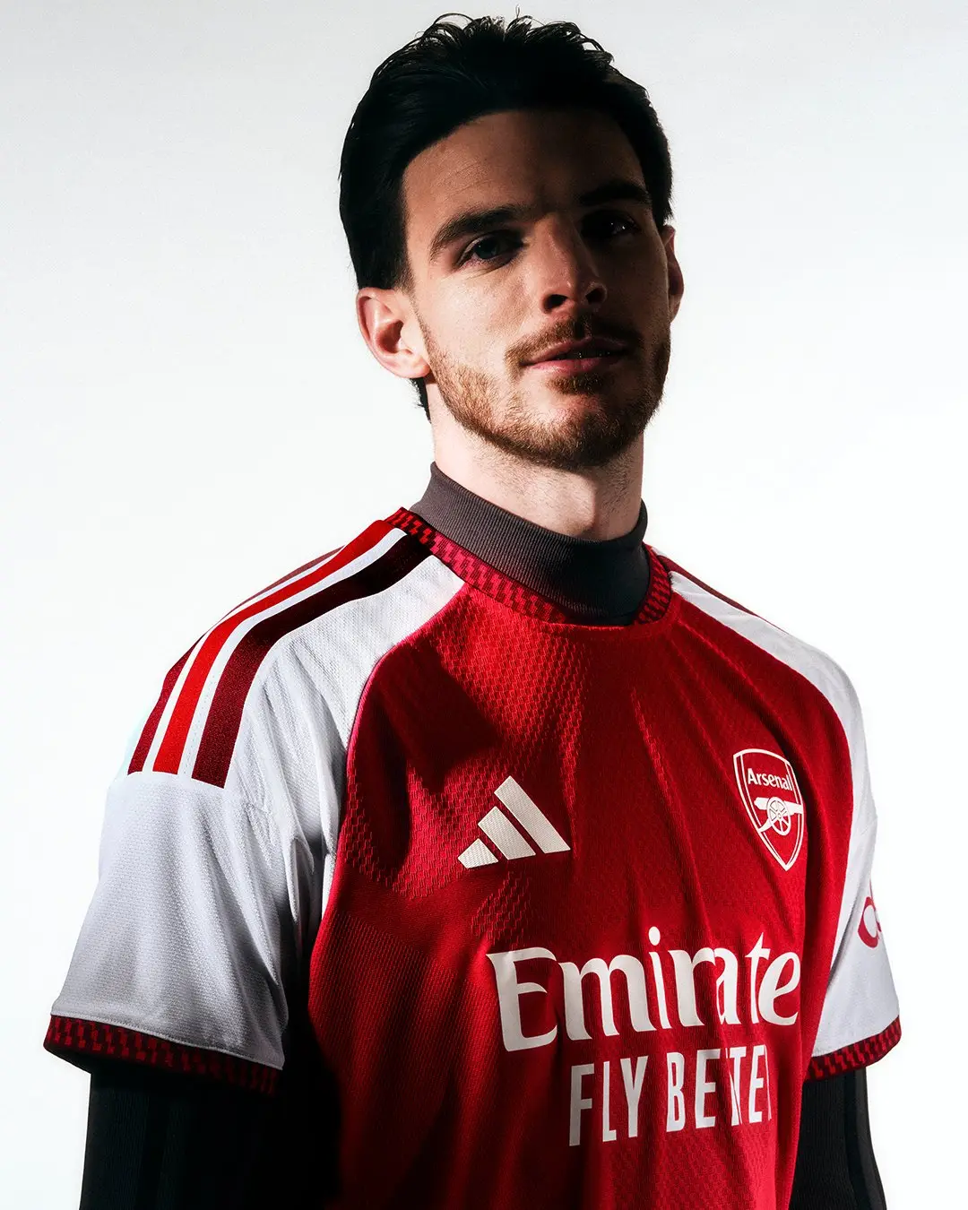
The design features subtle visual references to the Emirates Stadium, including a so-called "bespoke" crewneck collar inspired by the sweeping rooflines and subtle red patterning across the body, which apparently adds "depth and texture".
A solid look for the defending champions.
Aston Villa
Rating: 8
You can't beat a collar, right? Well, Aston Villa have introduced three-stripe detailing on their collar for the 2026-27 campaign, a stylish addition to the retro-looking shirt modelled here by new loan signing Alejandro Garnacho.
According to the club's website, the kit honours the more unconventional claret and blue concepts from that era with a clean and elegant look, creating a departure from the raglan-sleeved home shirts that Villa have worn in the modern era.

Bournemouth
Rating: 5/10
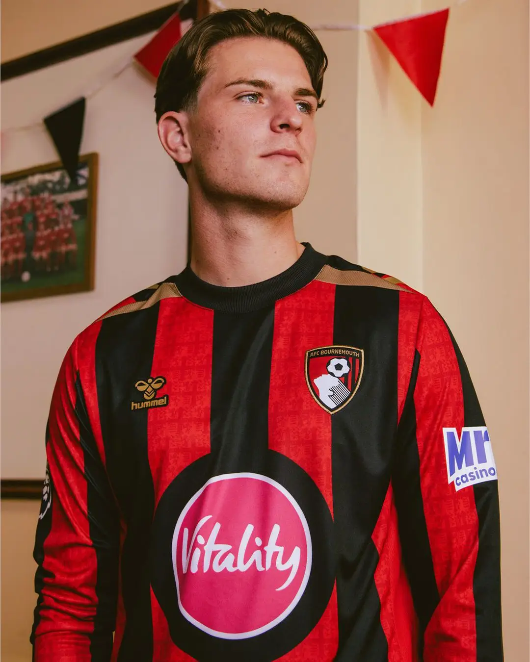
Bournemouth say that their new home shirt "embraces a classic look that reintroduces the club's iconic wider red and black stripes", but we can't get past the large front-of-shirt sponsor.
Away from the Vitality logo and Danish sportswear brand Hummel, who have created some memorable shirt designs over the years - including Denmark's iconic shirt from 1986 - have excelled. We appreciate the gold details.
Brentford
Rating: 8/10
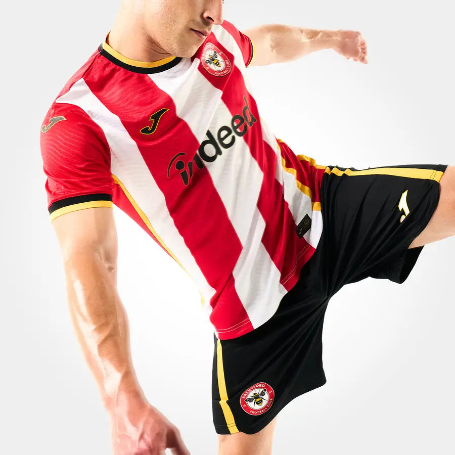
Brentford are continuing the club’s commitment to affordability and sustainability through another two-year rollover but this time, the home kit is in collaboration with new kit partner Joma Sport and front-of-shirt partner Indeed.
The shirt combines Brentford's iconic red and white stripes with honey yellow detail on the collar, cuffs, side panels, and around the crest and partner logos. Big fan.
Brighton & Hove Albion
Rating: 7.5/10
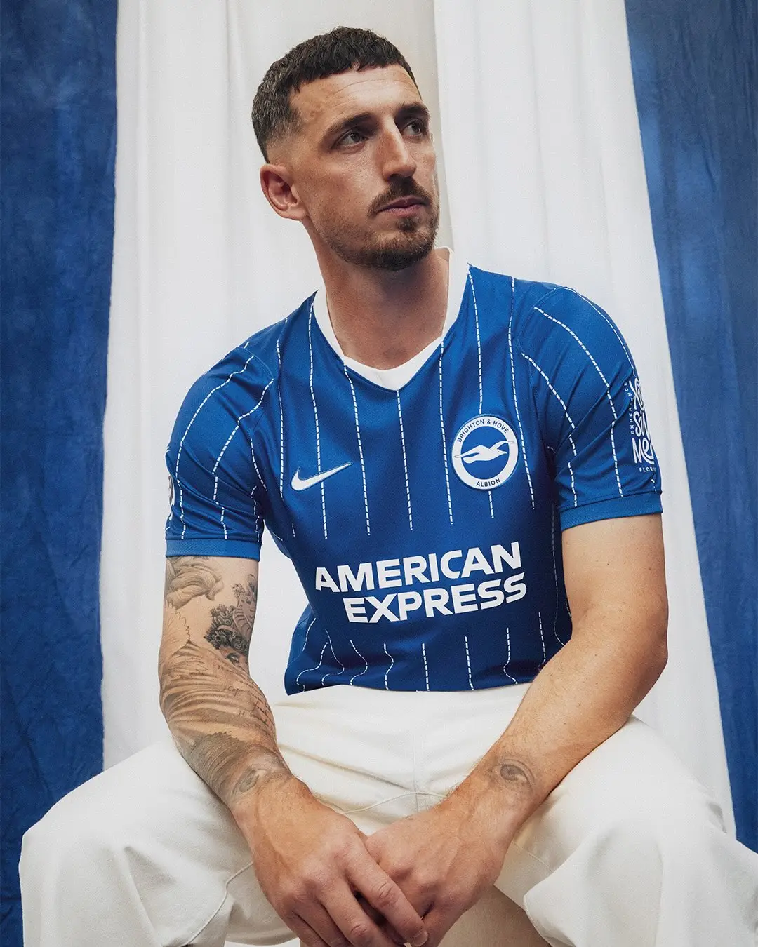
This season, Brighton's home kit draws inspiration from the 1983 FA Cup final, a game in which they lost to Manchester United. The classic white pinstripe and contrasting white neckline is a winner, in our book.
Chelsea
Rating 6/10
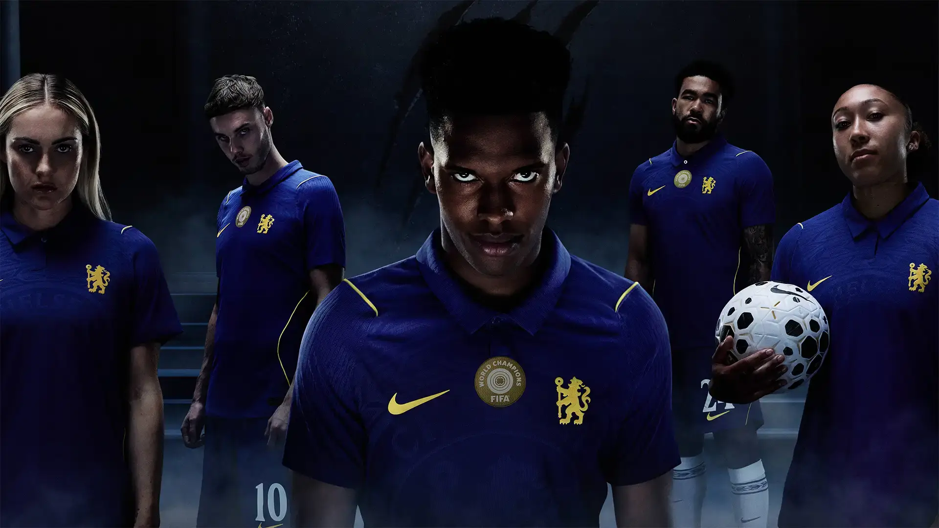
Yes, we enjoy a collar, but we're not entirely convinced by the button-down neck and minimalist look of the shirt. The trademark lion takes centre stage in a so-called "refreshed" club crest, but it lacks subtlety.
In better news, the Aero-FIT shirt is Nike's first elite performance apparel made from 100 per cent textile waste as Chelsea look to reduce the footprint and help players adapt to the impact of climate change.
Coventry City
Rating: 10/10
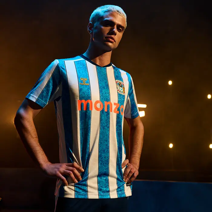
Well, that's one way of introducing yourself to the league. After a 25-year absence from England's top flight, Coventry have dropped a stunning design inspired by the 1987 team that lifted the FA Cup.
The four-tone sky blue jacquard pattern is inspired by the scenes that filled Coventry city centre when they won the trophy, while navy pinstripes run through each stripe reference the original 1987 design. Hummel have smashed this one.
Crystal Palace
Rating 7/10
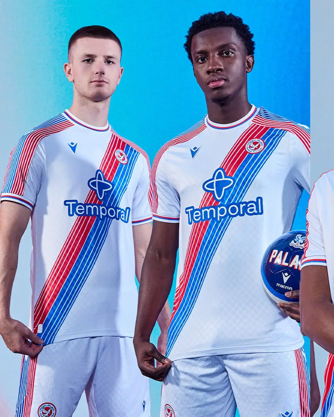
As far as necklines go, Palace have won first place, although we're not enamoured by the design of the new front-of-shirt partner, tech company Temporal.
The body of the shirt apparently features a subtle embossed eagle etched out onto the stylish black design, while the "vibrant" shirt features a black base with red and blue detailing on the crew neck and sleeve cuffs.
Everton
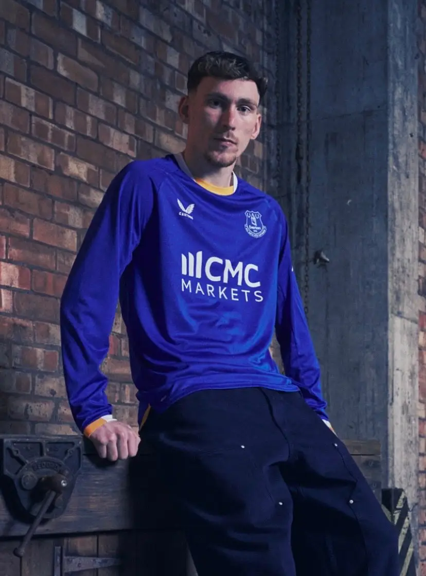
Rating: 6/10
One of the big talking points from this drop has been the branding of new main partner CMC Markets, who take over from Stake on the front of Everton's shirt. Is it subtle? No. Does it have that wow factor? Not really.
The 2026-27 home shirt sees the return of trinity amber in the rounded, white cut-away collar and on the outside of white-trimmed sleeves. We like that, to be fair.
Fulham
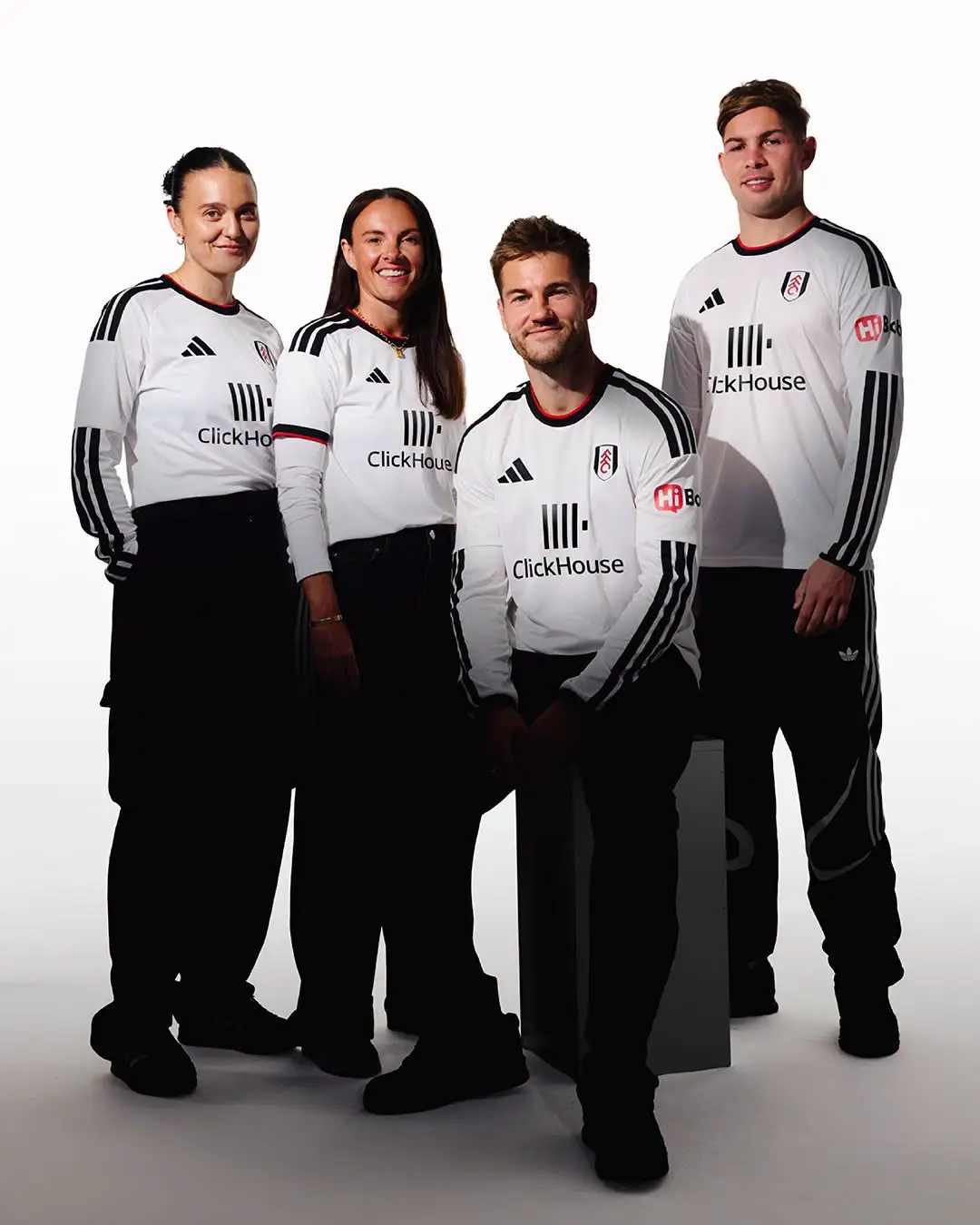
Rating: 6/10
Fulham's new home shirt features a "unique" pattern woven into the fabric of the shirt, inspired by the movement of the water created within the river beside their Craven Cottage home.
This kit is the first to feature the club's new front-of-shirt partner ClickHouse.
Hull City
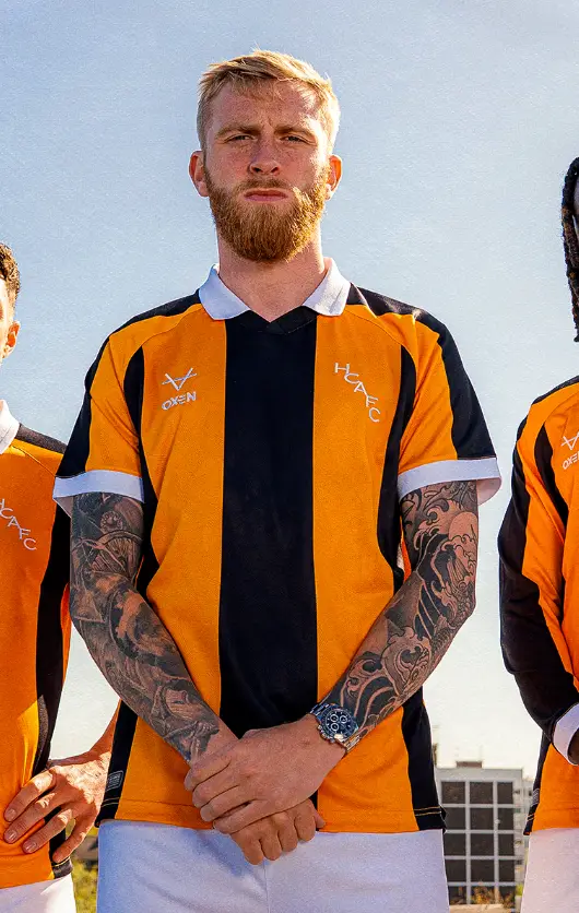
Rating: 8/10
Finally, we have a shirt that isn't just a template design and brings something different to the table.
Inspired by one of the most iconic periods in the club's history, the late 70's, the shirt features a classic white rib collar that references that era, whilst bespoke jacquard detailing brings a modern feel. Fair play, OXEN Sports.
Ipswich Town
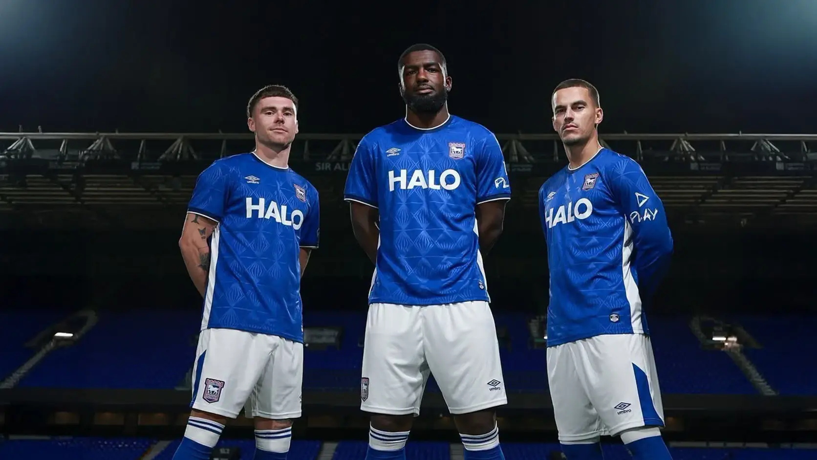
Rating: 7.5/10
Umbro are as solid as it gets when it comes to shirt designs, and Ipswich's home shirt that takes inspiration from the so-called "atmospheric" evening games under the Portman Road lights is no different.
Also, the club used its kit launch as an opportunity to make a significant donation to support grassroots football across Suffolk by offering every club in the county a grant towards their youth team kit for the new season. Respect.
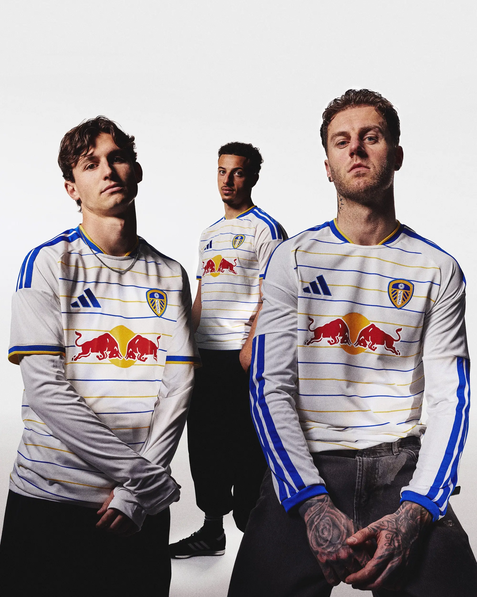
Leeds United
Rating: 8/10
As well as the now-iconic Red Bull logo, Leeds' new home shirt features blue and yellow horizontal pinstripes, a welcome addition to the latest release that celebrates 400 years since King Charles I granted the Leeds Town Charter on 13 July 1626.
The club say they have reimagined one of their most recognisable colour palettes through a modern design. We like it.
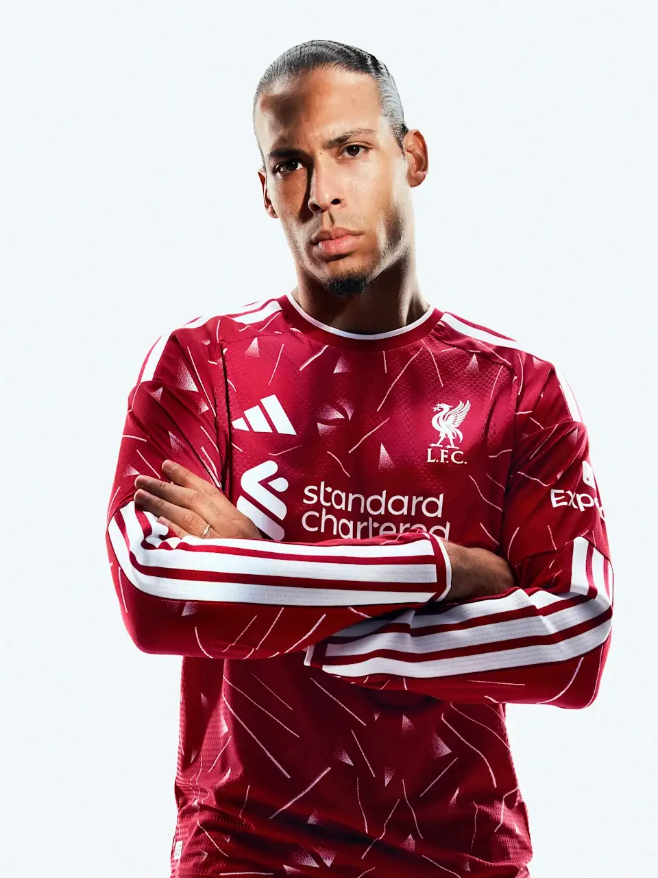
Liverpool
Rating: 7.5/10
Inspired by the strip worn during Liverpool's 1989-90 title-winning season, the old school Adidas design featuring that iconic geometric pattern is a solid look, especially in a long-sleeve, as modelled by Virgil van Dijk below.
Not our favourite kit drop of the season by any means, but certainly not the worst.
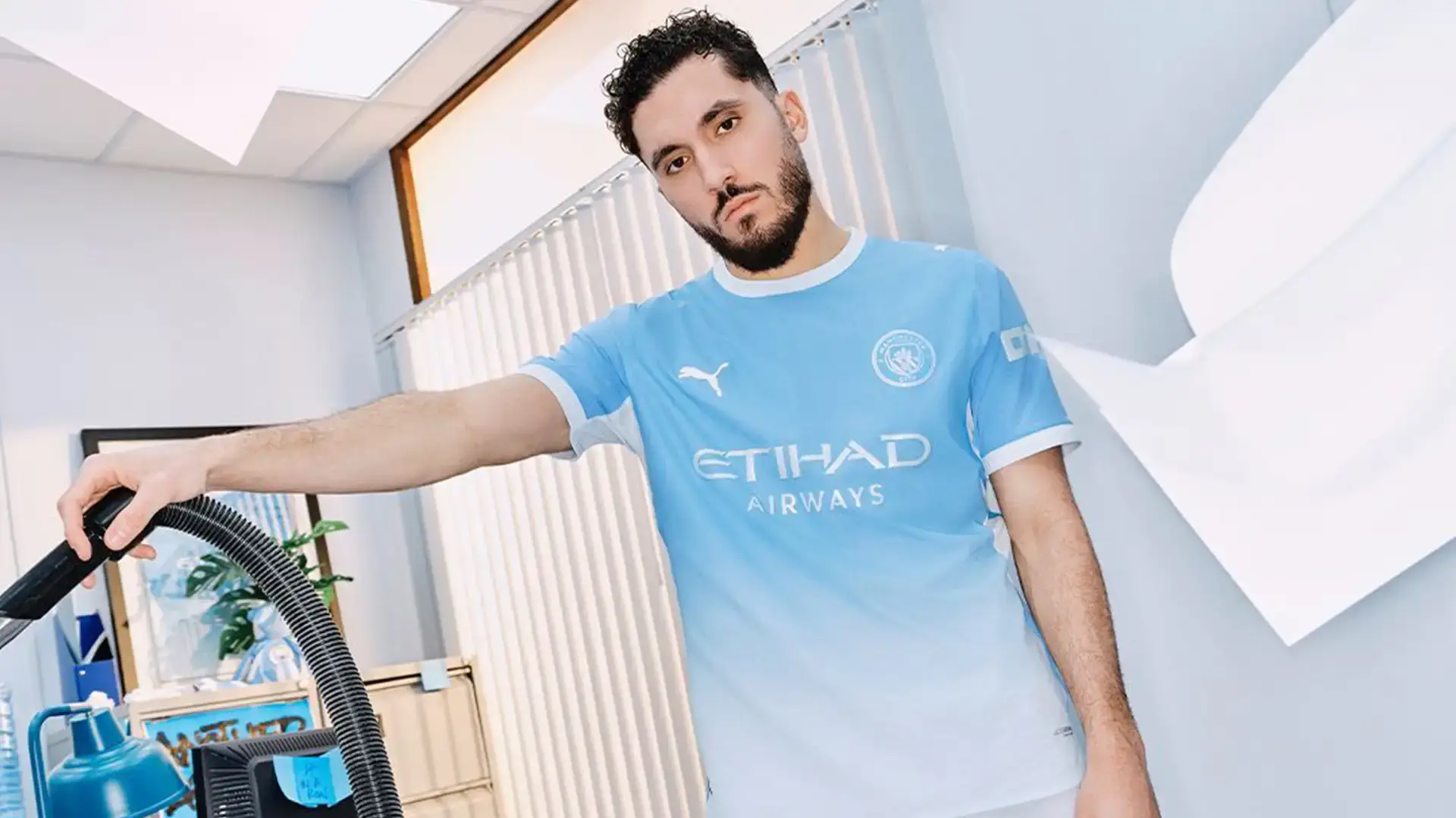
Manchester City
Rating: 8/10
Featuring a tonal gradient that darkens across the shoulders before fading into a lighter shade, City's new home kit is said to "reflect the relentless ambition of a club that has spent years making the extraordinary feel routine".
A modern, sleek design that will, in our opinion, go down as one of City's best home shirts in recent years.
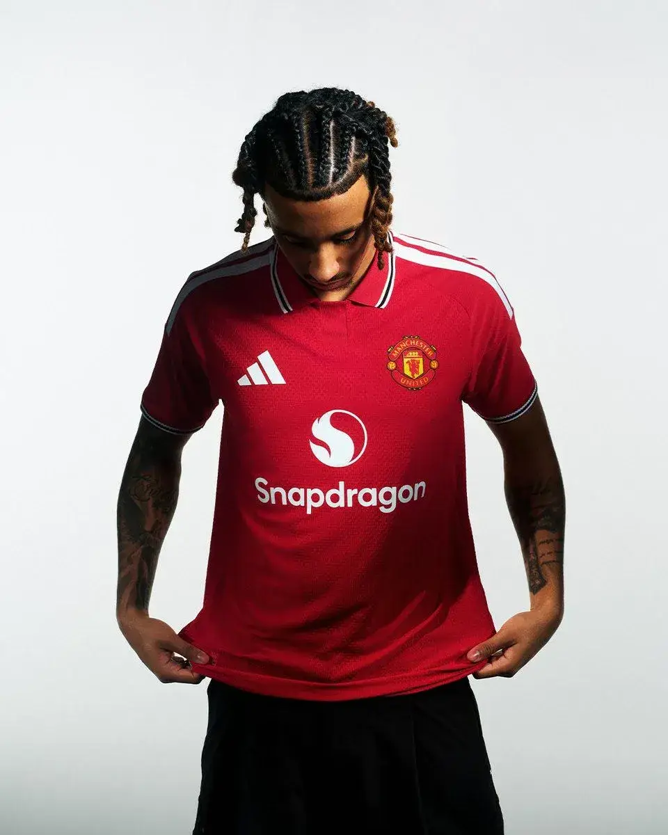
Manchester United
Rating: 6.5/10
Apart from the polo collar and striped cuffs that are inspired by the kits worn during the club’s FA Cup triumph in 1977, Manchester United's new home kit looks similar to the one they wore last season.
According to the club's website, the jersey feels both nostalgic and progressive. We're not entirely convinced.
Newcastle United
Rating 5/10
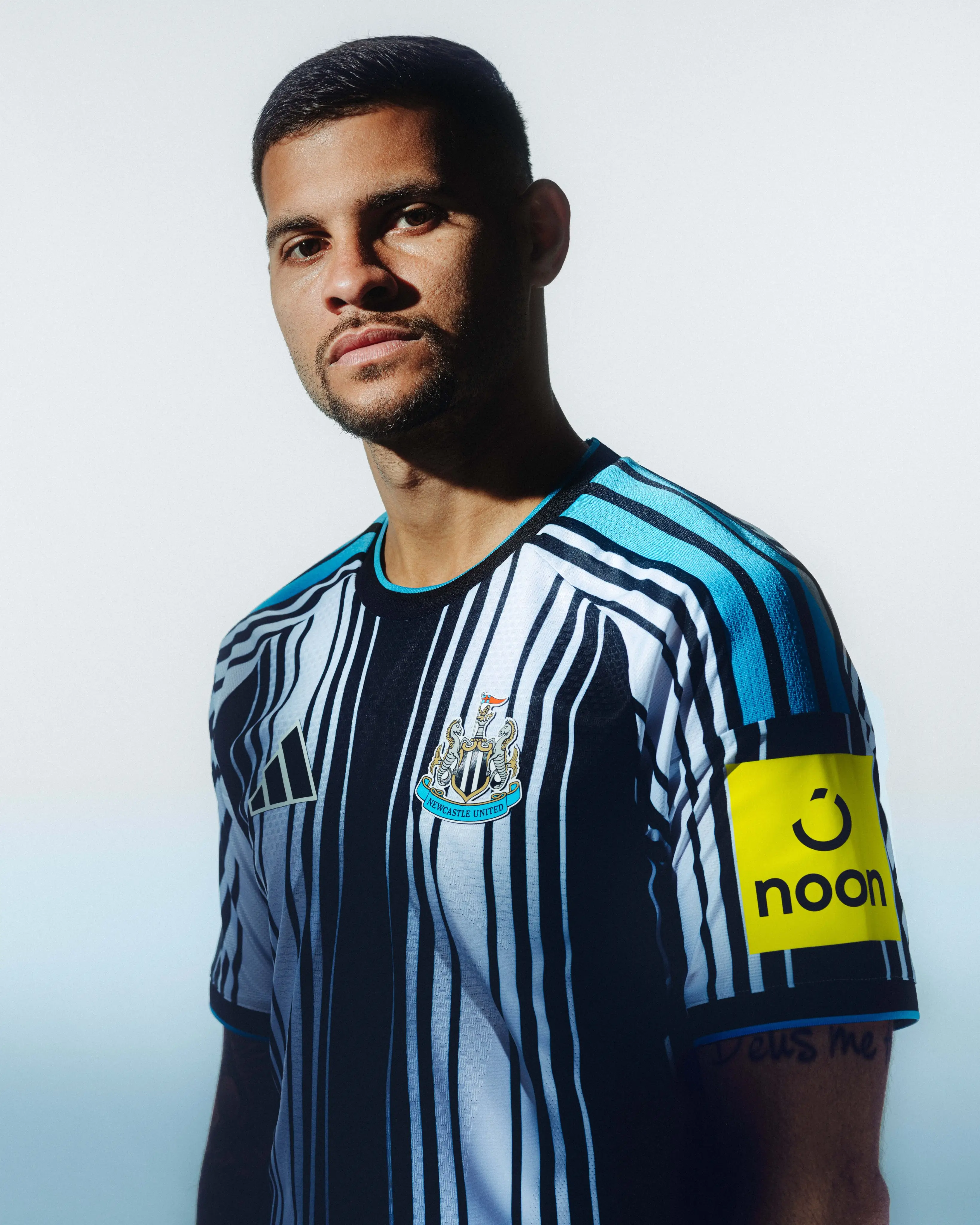
As far as home kits go, Newcastle's release for the 2026-27 campaign is one of the most-talked-about drops of the summer, with many comparing it to a barcode.
The club have described it as a "future-thinking" and "progressive" jersey. That's one way of putting it.
Nottingham Forest
Rating: 6/10
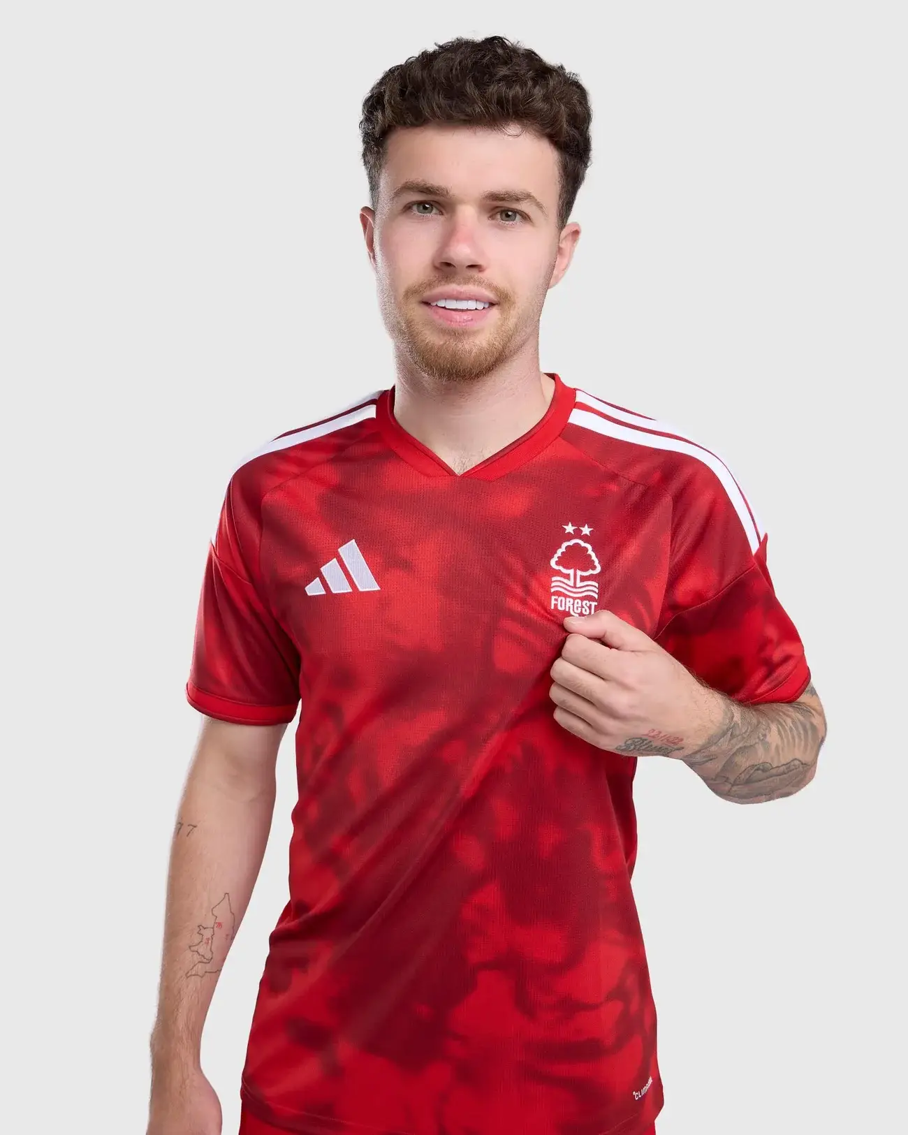
As well as the traditional red base, Forest have opted for an all-over tonal graphic inspired by mist rising from the River Trent. It is also said to pay homage to the club's pre-match anthem, Paul McCartney and Wings' classic "Mull of Kintyre".
Middle of the road stuff.
Sunderland
Rating: 10/10
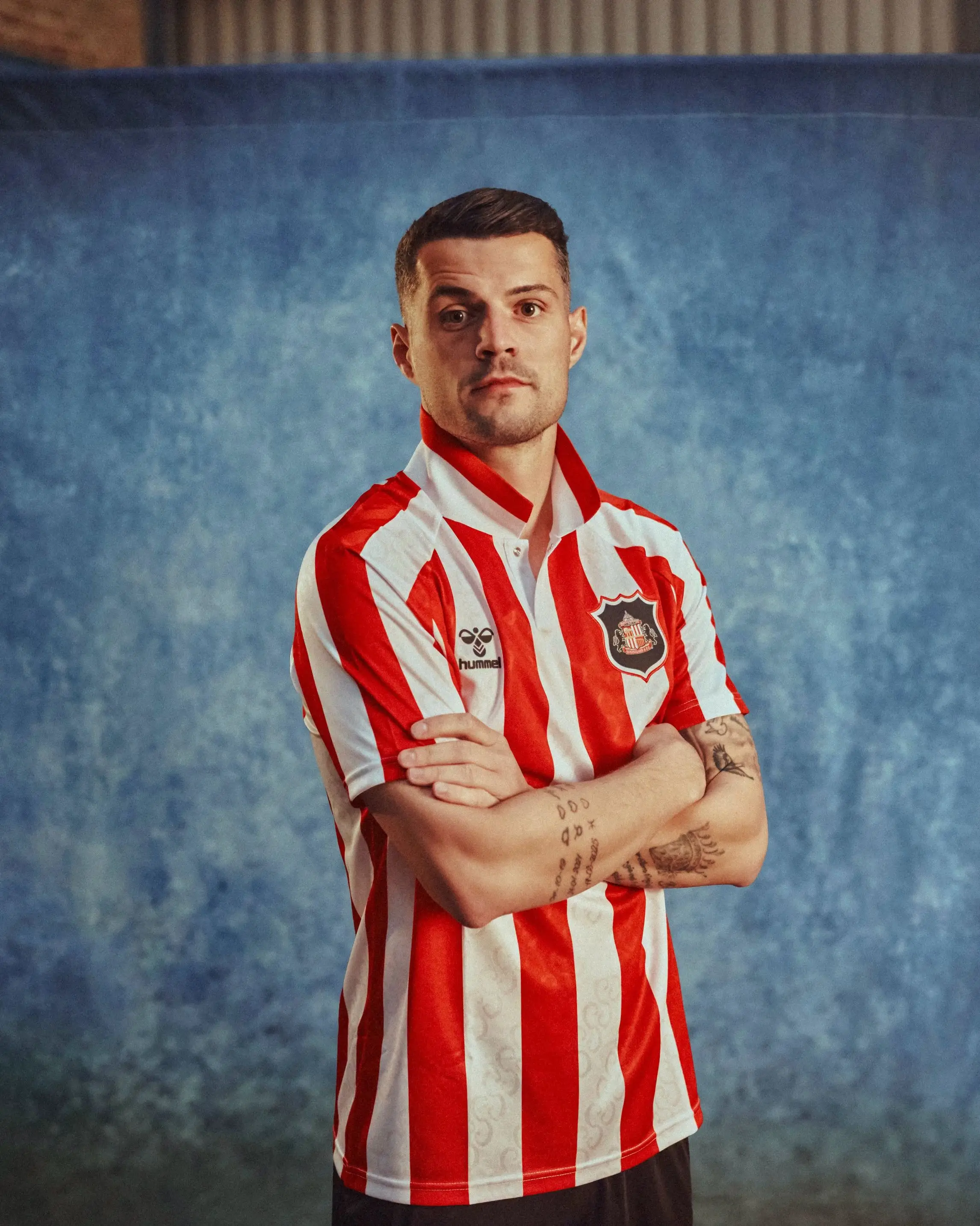
This was well worth the wait. Unlike every other team, Sunderland waited until the end of July to release their home kit for the 2026-27 campaign.
As well as a tonal jacquard pattern running throughout the shirt, Hummel have used a repeated letter “S” that is formed from the handles of the FA Cup, a trophy they won in 1937 following a 3-1 win over Preston.
In another classy touch, the starting eleven from Sunderland's FA Cup win can be seen inside the neckline. A thing of beauty.
Tottenham Hotspur
Rating: 6/10
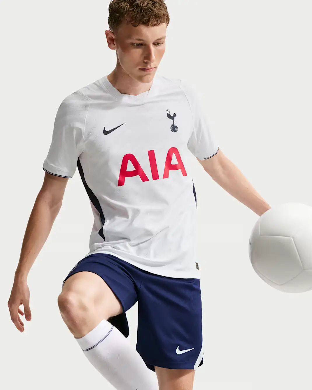
According to the club's website, Tottenham's new home shirt is a nod to their heritage at a time of reconnection. Yes, the navy blue trims under the arms are a nice touch, but this looks very similar to their previous releases. Forgettable.
 Jack Kenmare