Ranking the best kits at the 2026 World Cup including South Africa's generational away shirt
Can you believe it? We are just 80 days away from witnessing the opening match at this summer's World Cup, an event that will be welcomed by kit-lovers all over the world.
The tournament will get underway on June 11 as co-hosts Mexico welcome South Africa to the famous Estadio Azteca in Mexico City.
Mexico will wear a shirt that pays homage to one of their most iconic jerseys, the 1998 World Cup design worn in France, while South Africa are expected to don their viral green and gold striped kit.
Inspired by the shirt they wore on home soil at the 2010 World Cup, it features traditional patterns and stripes, and could well be a fan favourite this summer judging by the reaction on social media.
Advert
Someone described the design as a masterpiece, while another commented: "The best national jersey I've seen".
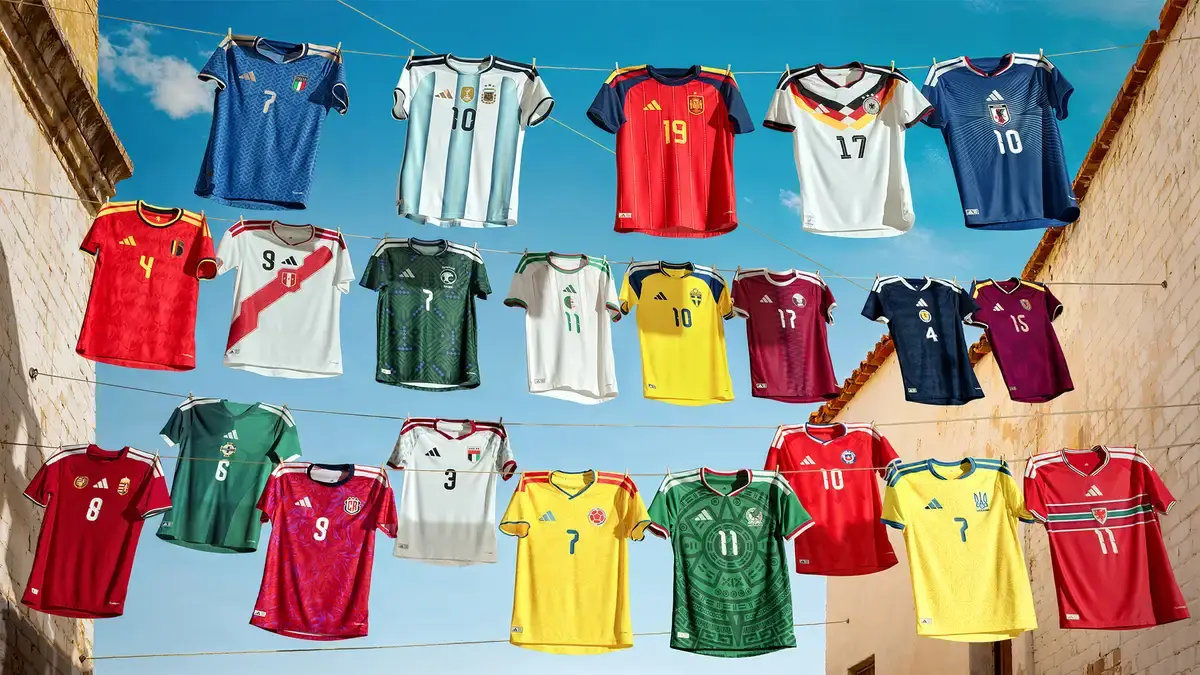
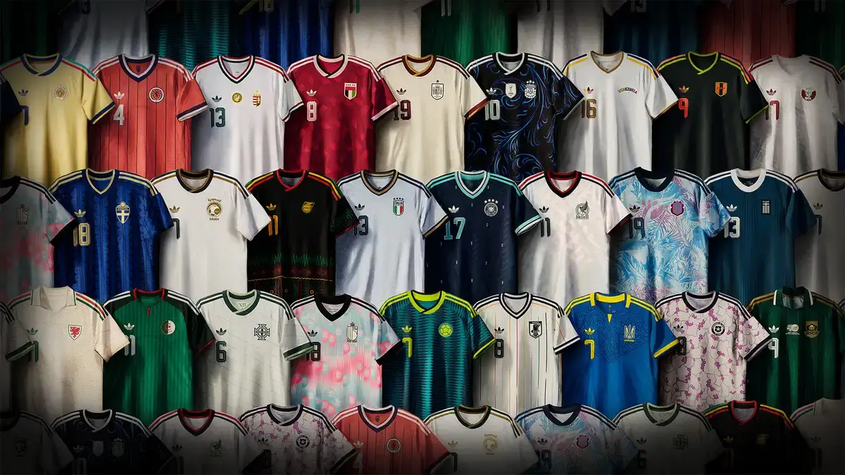
Most of those taking part in the 48-team tournament have been introduced to their new-look kit, with the likes of Adidas and Nike launching their designs to the wider public in recent months.
So, which kits stand out amongst the rest?
SPORTbible have decided to pick out some of our favourites ahead of this summer's showpiece event, and before you mention it, yes, we enjoy the classic Adidas trefoil logo, but who doesn't?
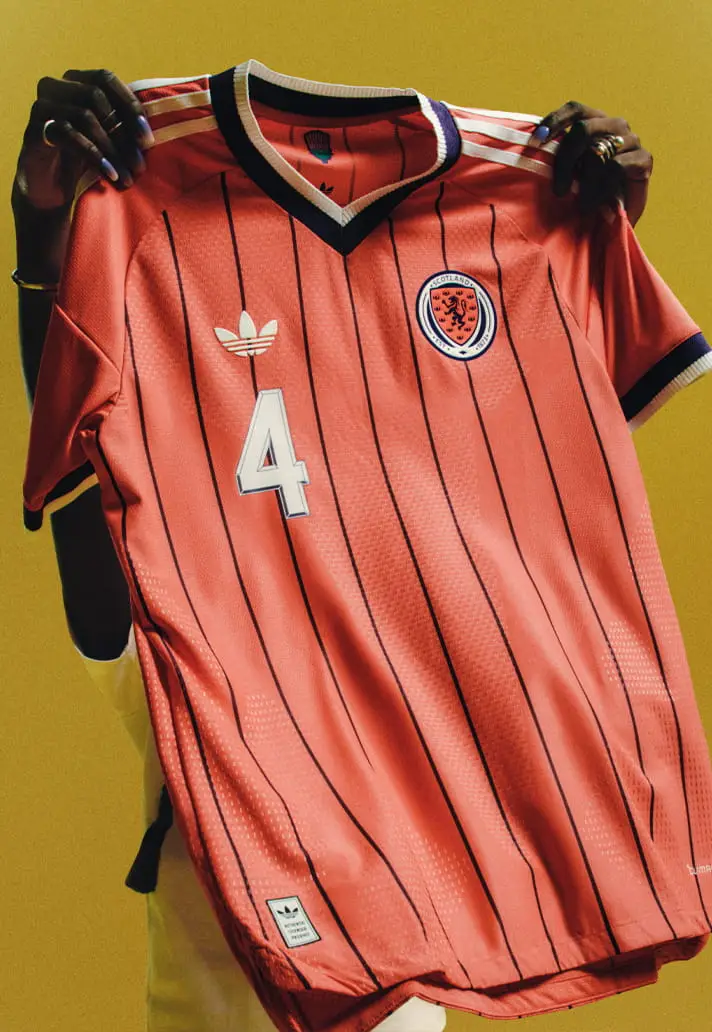
Scotland – Away
Blending heritage with a contemporary aesthetic, Scotland have returned to scarlet red – last used in the 1980s – for this summer's World Cup.
The design draws on some of Scotland’s most iconic away kits, with its vertical purple pinstripes "adding depth and detail to create a dynamic look that stands out on the international stage."
Sometimes, simple is best. SPORTbible rating: 9/10
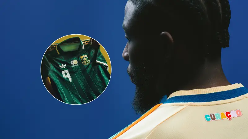
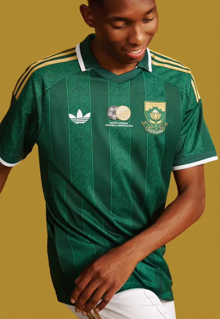
South Africa – Away
Inspired by the kit they wore on home soil at the 2010 World Cup, South Africa might just scrape the award for best kit at this year's World Cup.
The updated design pays tribute to South Africa's 12 official languages, which is described by Adidas as "a powerful reflection of the nation's diversity, unity, and shared love for football."
Moreover, the subtle graphic elements woven into the fabric symbolise "the many voices that rise together in stadiums across the country and around the world."
Everything about this kit is sublime. From the dark green and gold colour combination to its stripes and traditional patterns, it really is a thing of beauty. SPORTbible rating: 10/10.
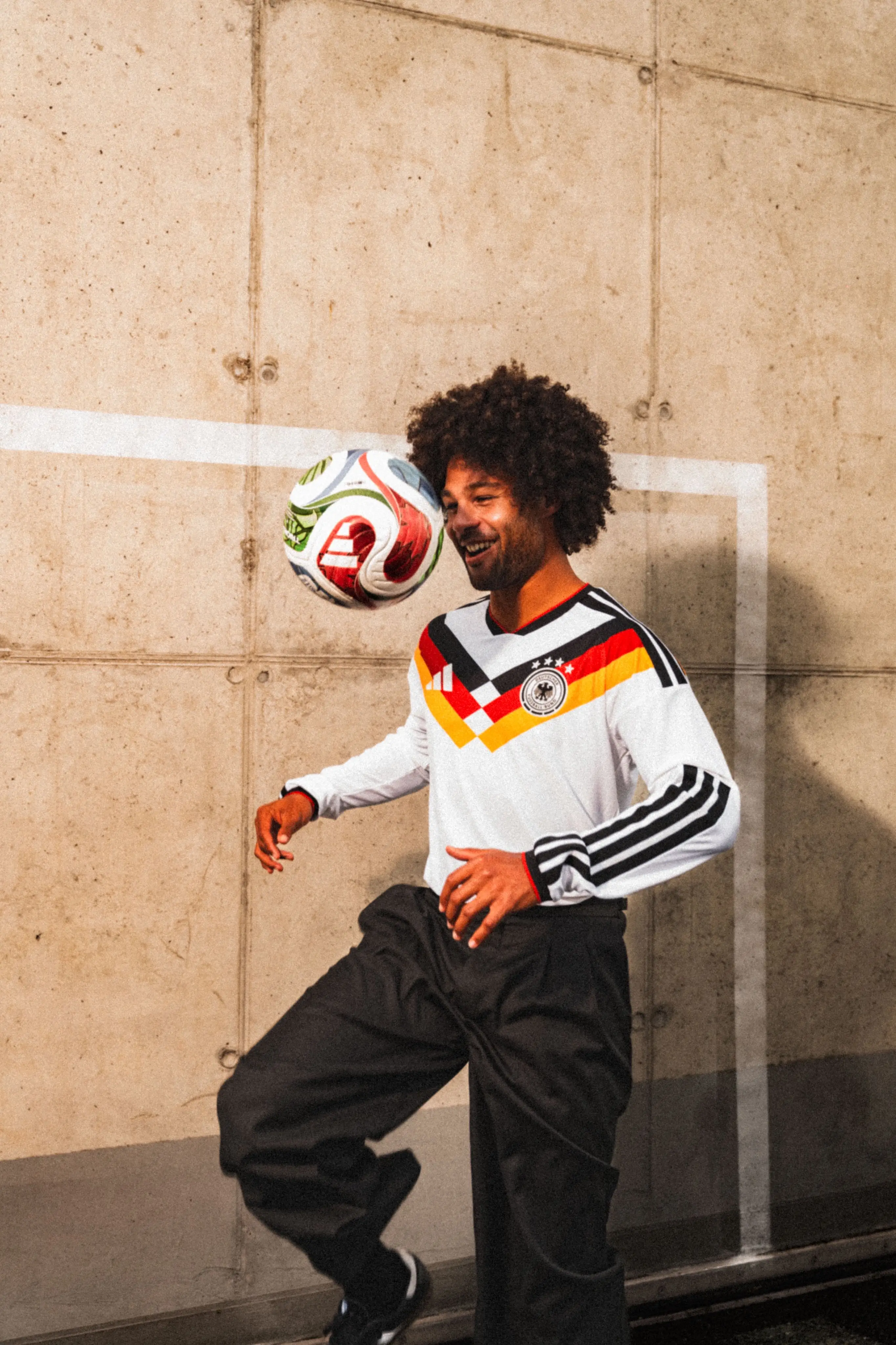
Germany – Home
Like so many of the other shirts at this summer's tournament, Germany has paid homage to some of the nation’s most iconic jerseys in years gone by, with its diamond shape and chevron detailing.
For us, long-sleeved shirts are a winner. A timeless classic which will be the last Adidas release before Nike take over. SPORTbible rating: 8.5/10
Curacao – Away
Another contender for the best kit at this summer's World Cup. The Curacao away kit celebrates the capital city, Willemstad, and the colourful buildings that reside in its Punda and Otrobanda districts.
A colourful tribute to Curacao's distinctive architecture, the shirt is predominantly pastel yellow, with bold pink, turquoise, and orange stripes, as well as blue details on its sleeves and cuffs.
A stunning jersey for the country’s first-ever World Cup. SPORTbible rating: 9.5/10

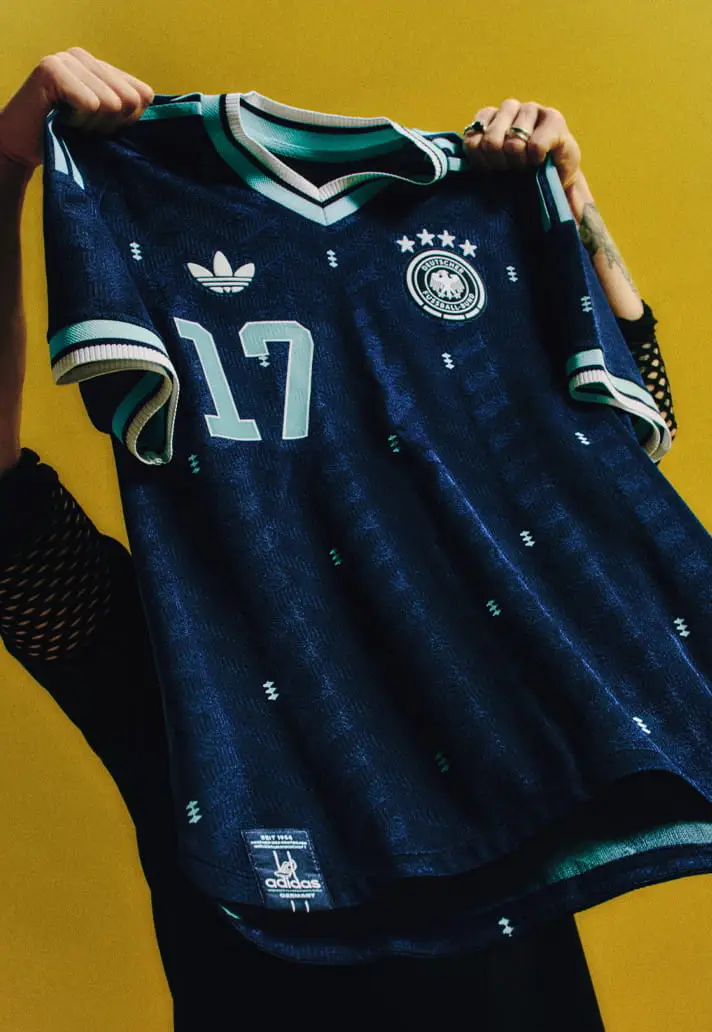
Germany – Away
For the second time in this list, Germany has been given a mention. And can you blame us? This shirt is a nod to the blue quarter zips worn in 1954, as well as the classic training tops of the 60s, 70s, and 80s.
Adding to the retro aesthetic, a continuous zigzag pattern of diagonal jagged stripes runs across the fabric, drawing inspiration from classic Adidas shoebox designs.
"I find a Germany jersey in this color unusual – but really good,” said Germany's Florian Wirtz. We agree. SPORTbible rating: 9/10
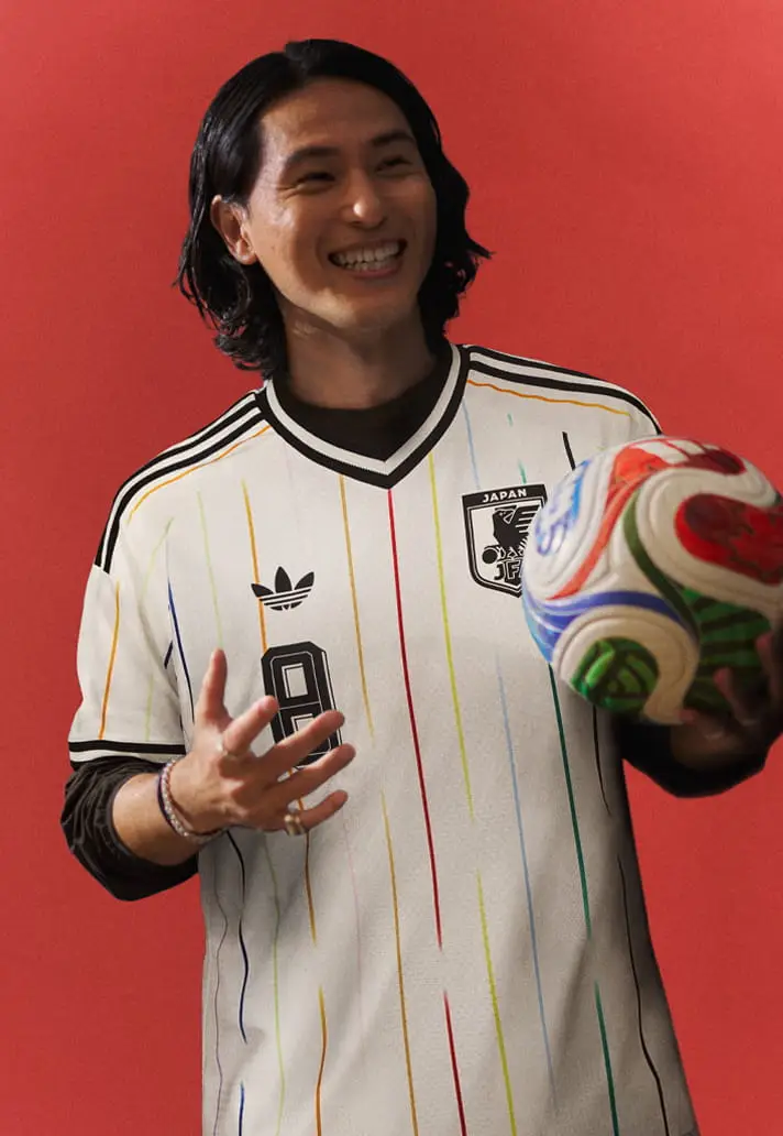
Japan – Away
The shirt features 12 vertical stripes over an off-white base, with eleven of those lines representing the players on the field. The red one in the middle? Well, that embodies the red sun of the national flag.
This design is reminiscent of baseball shirts, with the sport being one of the most popular in Japan. Simple, but effective. SPORTbible rating: 8/10
France – Away
One of only three Nike representatives on this list. (Sorry, we just love the trefoil logo).
France’s glacier green away kit for the World Cup pays homage to the Statue of Liberty, with its colours mimicking those of the statue, a gift to the US from France in 1886. In fact, this jersey is called "Liberté".
Meanwhile, the copper-colored rooster is another homage to the colour of the Statue of Liberty before its oxidation. SPORTbible rating: 8.5/10
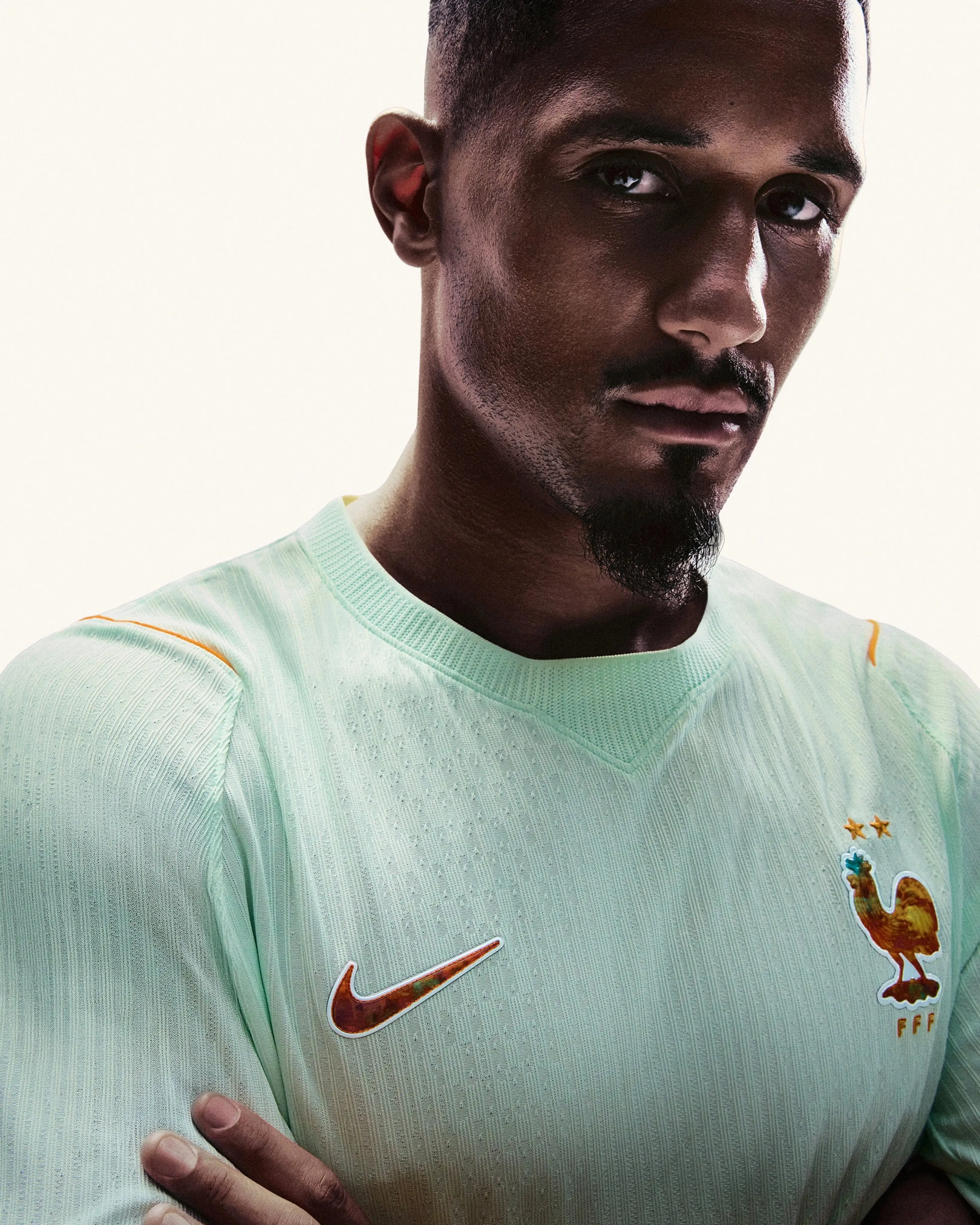 France's away kit for the 2026 World Cup. Image credit: Nike
Norway – Away
You can't go wrong with an all-black colourway. In fact, it is Norway’s first-ever all-black kit design.
Inspired by Viking Berserkers, who were elite Norse warriors that would often fight without armour and possessed immense strength, this design is minimal, but it works, especially in a long sleeve. Oh, and the silver logo and Nike swoosh hits.
According to Nike, the kit will channel strength through simplicity. SPORTbible rating: 8/10

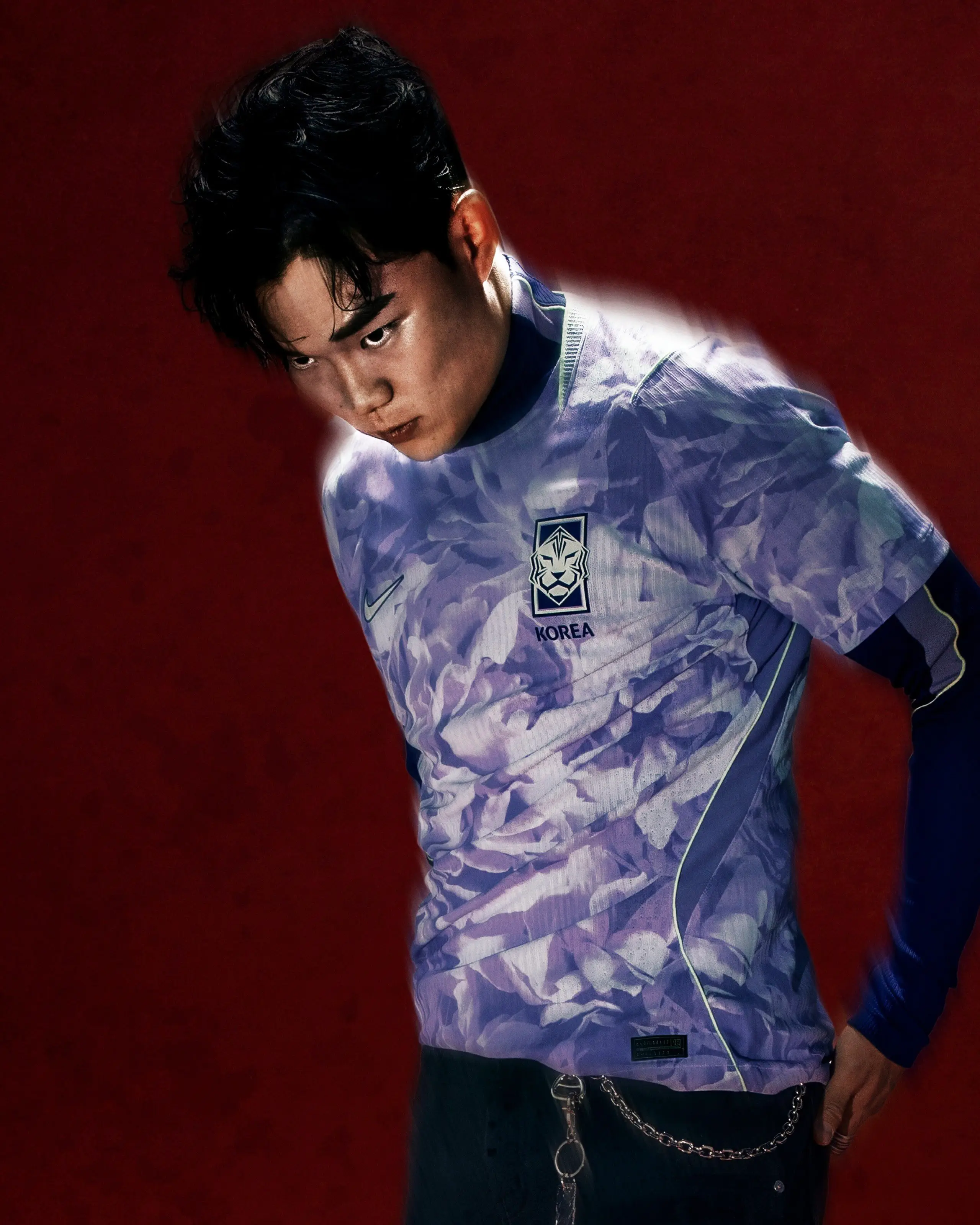
South Korea – Away
Inspired by the explosive momentum of a blooming flower, which visually expresses Korea's energy, this design features a unique Space Purple base with a striking violet palette.
This is a serious contender for best kit at this summer's World Cup. SPORTbible rating: 9/10
Honourable mentions
Adidas have released a bunch of international jerseys ahead of the World Cup, even for those who failed to qualify. We couldn't help but include a couple.
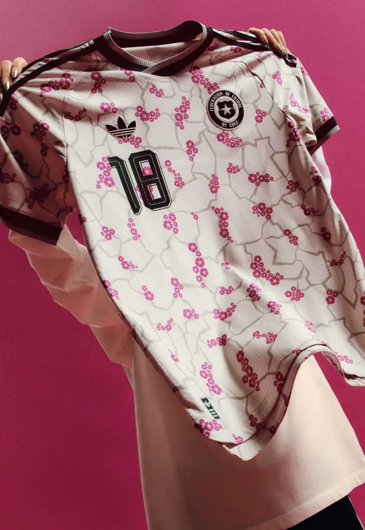
Chile – Away
Chile's vibrant away kit pays homage to the Desierto Florido, a rare natural phenomenon that occasionally transforms the Atacama Desert into a colourful bloom.
A recurring theme in this list is Adidas and its wonderful retro trefoil logo. For the first time in 36 years, the classic logo has returned to the international football stage, and we couldn't be happier about it.
The classic Originals look injects a 90's vibe to proceedings and this kit, with its striking floral graphic and earthy crackle design, is a joy to behold. SPORTbible rating: 9/10
Costa Rica – Away
Inspired by the colourful toucan, a bird that symbolises social connection, this all-over blue and fuchsia design embodies the spirit of Costa Rica's friendly and joyful culture. One thing is for sure, it will stand out on match day.
The pastel pinks and blues are wonderful. Not everyone's cup of tea but we're a big fan. SPORTbible rating: 8.5/10

Thoughts on our list? Which one is your favourite? Let us know in the comments.
Topics: FIFA World Cup, South Africa, France, Japan, Germany, Scotland, Adidas, Nike