Australia
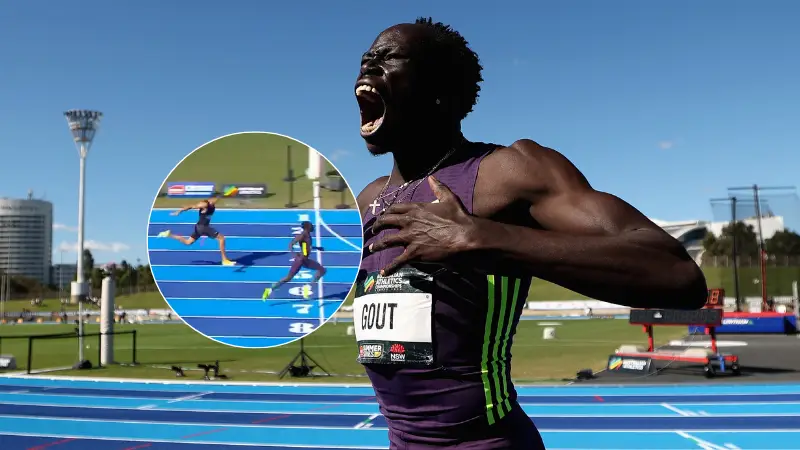
Gout’s performance in Sydney has come under scrutiny.

Jack Kenmare
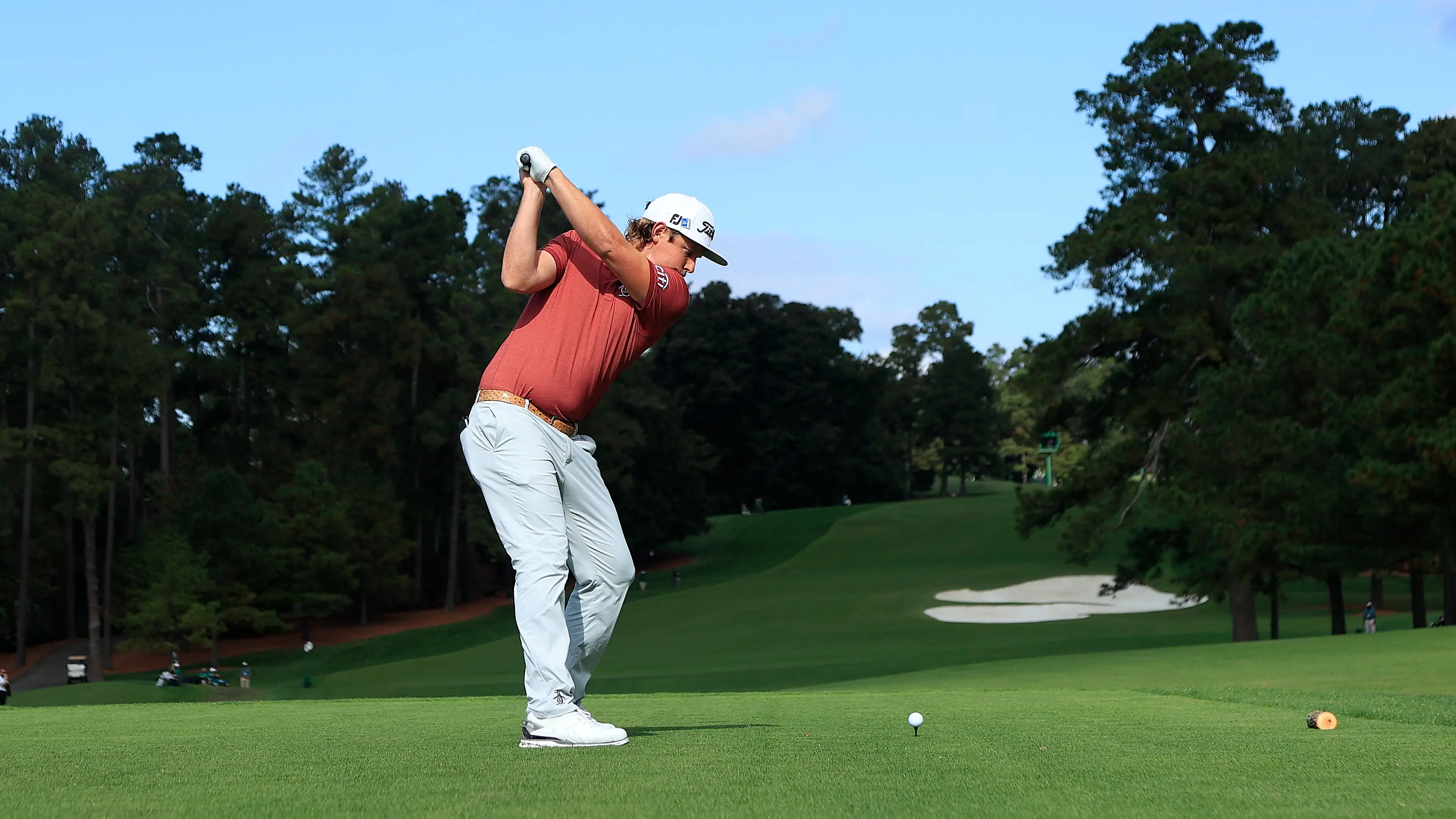
He became the first golfer in the 84-year history of the Masters to achieve the feat.
Jack Kenmare
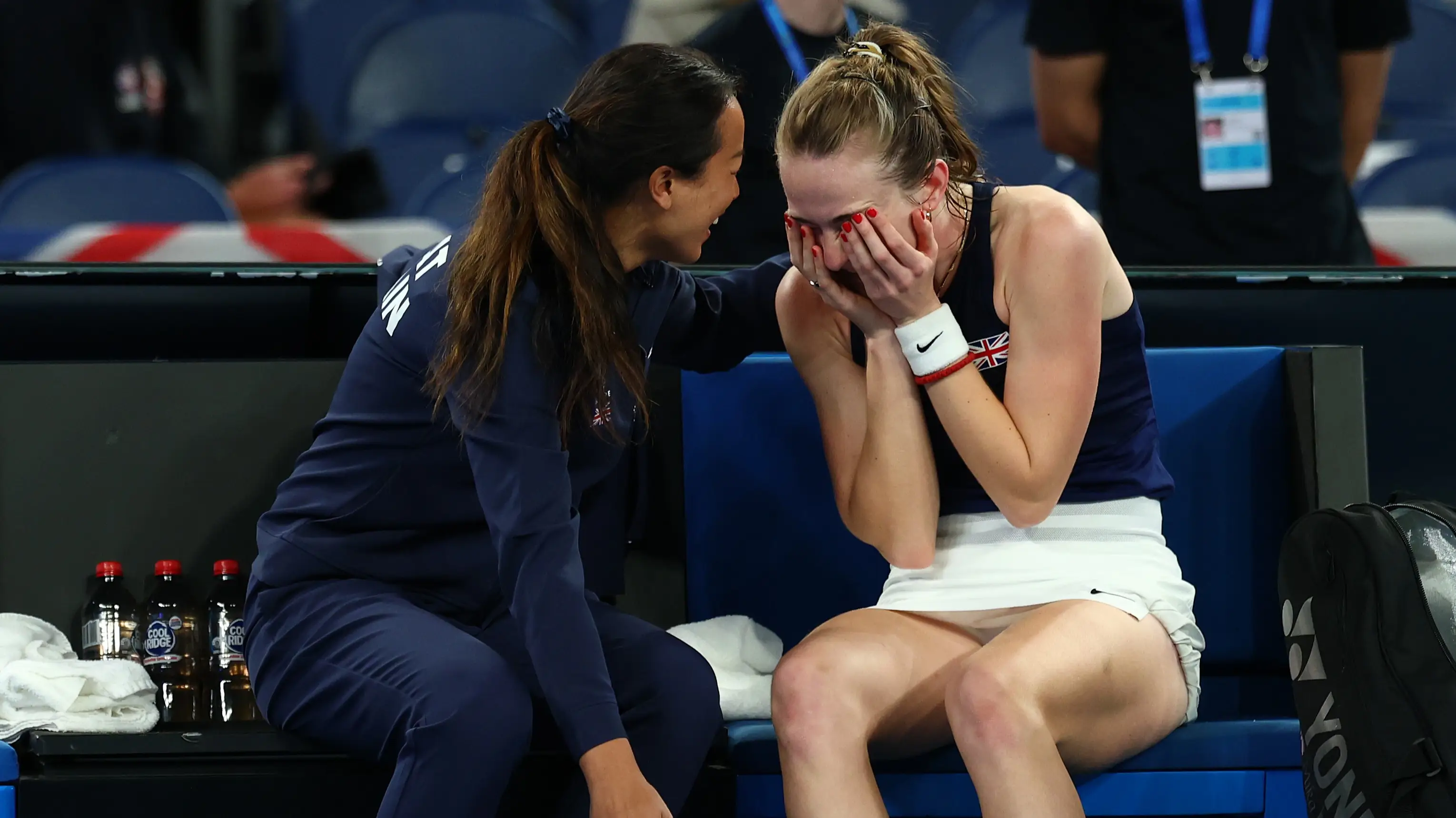
She overcame the odds on her Billie Jean King Cup debut.
Jack Kenmare
He has taken to social media.

Tom Jenkins