
As the opening match of Women’s 2023 World Cup dawns nearer, it’s now time for the most important aspect of all.
All 32 teams have released their jerseys for the impending World Cup, so without further ado, here is a completely objective list ranking the jerseys from 32 to one, with one being the most amazing, appealing and artistic jersey in this year's World Cup.
32 - Portugal
Advert
Okay so looking at their home kit, you might not understand why they’ve been put down so low. I mean it’s nothing amazing, but also the red shirt has some nice dark green edging.
But the away kit.
Advert
Yikes. They’ve gone for what seems like green and red confetti on a white jersey and it just doesn't make the mark.
31- United States of America
While the blue away jersey has some interesting striped details on it, I’m too distracted by the home jersey.
Advert
A white home kit with small blue paint splodges. It’s giving chaos.
I need to know who approved of this design.
30- Ireland
The green home kit is um, definitely something. The jersey also features thin white and yellow lines which aren’t thick enough to be picked up by the eye so it just looks a bit not quite right.
Advert
Their away jersey, which is white with green horizontal stripes, is giving rugby vibes.
29- Costa Rica
While the red and white kits look quite smart on the players, it feels like it’s missing that World Cup Oomph.
There’s nothing really striking about these, but maybe that’s what you need so you don’t feel too overwhelmed watching all the matches.
Advert
28- Haiti
I like the bold blue of the home kits. The deep colour is here to help Haiti make a statement
However, they’ve put some fleurs-de-lis design over the top of both of the kits which you have to strain your eyes to see which just makes it feel a little messy.
27- Vietnam
Like Haiti, Vietnam have also put some small intricate design on their home jersey but the red is too dark to be able to clearly make out what the design is.
Other than that, it’s a pretty plain red jersey, with the country’s flag in the right corner.
26- France
Similar to Costa Rica, I wanted more from France. The stripes on the are a bit chaotic and they’ve gone with a blue that’s much lighter than their usual royal blue.
Their white home kit is inspired by the art movement Orphism from the 1920s, so points for trying I guess.
25- Netherlands
The Netherlands are back with their iconic orange look. They’ve gone with a lighter orange and funky pattern that confuses the eye from afar.
The away kit looks like they dropped blue paint on a navy top and called it a day.
24- Norway
They’ve gone for a classic look with a red home kit and a white away jersey with a few navy embellishments.
Pretty stock standard.
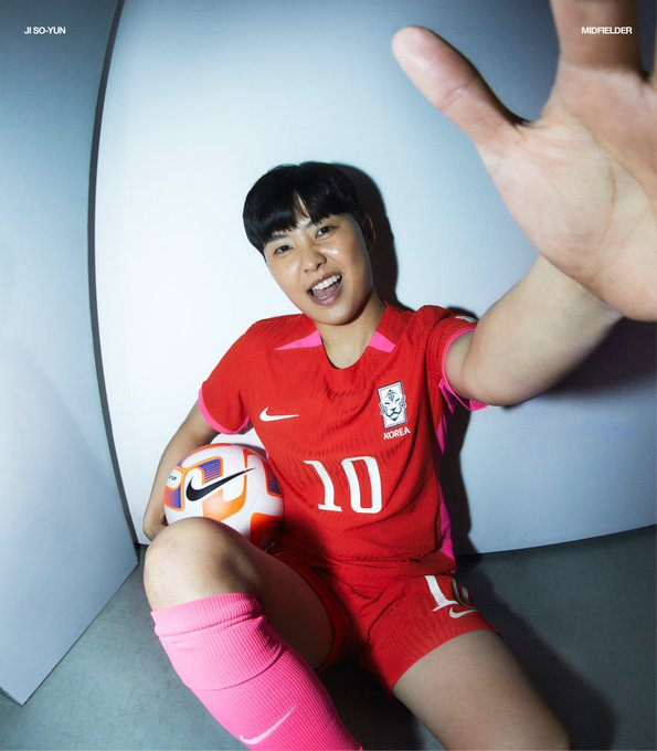
23- South Korea
Similar to Norway, in that it’s nothing we haven’t really seen in a jersey.
The blue and red stripe under the arm on the away kit is a nice touch.
22- Panama
It's a step up from the plainness of Norway, with at least some attempts to be creative.
The home kit features a funky hexagonal pattern, which is a nice nod to the soccer ball and they’ve designed a simple white jersey for their away games.
21- Morocco
One of the last countries to reveal their jersey, Morocco has delivered us a red home kit with almost tiger-like stripes in a deeper red across the front.
It’s fierce. It’s ferocious. Competitors beware.
20- Spain
The home kit feels very traditional, a red jersey with a navy and gold striped collar while the away kit definitely gets points for its creativity.
Inspired by the Spanish coral reefs, a coral-like pattern appears across and down the arms.
Again, they’ve definitely tried to be creative but it kinda looks a bit like magenta-coloured blood stains.
19- Sweden
The placement of the Swedish soccer logo right in the middle of the yellow home jerseys feels a little off-putting but maybe that’s just me.
The blue splodges on the away kit look like the should work in theory but it could end up looking like sweat patches, which is not a vibe.
18- Argentina
In a move that everyone saw coming, Argentina will be donning their classic blue and white stripes for their home games, and while I am quite partial to the blue and white, we need to talk about their away kit.
The away kit is inspired by the Argentinian Quebrada de Humahuaca mountain valley, and it’s definitely a bold choice.
17- Germany
Germany’s away kit has a similar vibe to Argentina, it’s definitely out there and I applaud them for trying.
Their home kit features a black stripe on a white jersey, but the stripe feels uncomfortably big. Like the proportions are just a little off.
16- China
China’s home and away kits are beautiful inverses for each other which make it so aesthetically pleasing on the eye. It’s the perfect example of less is more. (Take note Portugal)
The jerseys are also inspired by the Chinese symbol for goodluck xiangyun, so the other teams better watch out as they’ll be coming out strong.
15- South Africa
The vibrant yellow of the home kit works in tandem with a more deep, darker green.
The two kits also have some nice, intricate designs on them which add a bit of creativity.
14- Switzerland
A fresh take on a red jersey with white stripes.
They’ve got thin white lines with white circles throughout them, but they’re a tad too small so they just look like specs of rubbish.
The jersey is made up of different hues of red meant to look like a mountainside, which is a cool touch.
13- Australia
Okay, full disclosure, I am Australian. But, You just can’t fault the home team. Inspired by the outback and beaches, the jersey takes the golden wattle colour with a marble pattern.
And while the decision to make the away kit pastel turquoise might be strange to some, it will be hard to hate on it when the legendary Sam Kerr is scoring goals left, right, and centre in it.
12- Zambia
Continuing on with some more yellow and green, Zambia have pulled through with refreshing home and away kits (and a bonus kit too!)
The yellow home kit features a sophisticated line of black diagonal lines down the right side of the jersey. They’ve also got a matching green jersey with yellow, red and black diagonal lines.
Their white away jersey has a nice green collar on it to really make it pop.
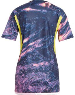
11- England
The home kit is light blue, with a pattern that is supposed to represent the bricks at Wembley Stadium. It kinda feels like it would have been my wallpaper on my iPod touch back in the day.
They’ve gone for a more plain white away kit, with a blue stripe on the sleeves, which gives England less of a chaotic vibe.
10- Philippines
A classic deep blue jersey with thin red stripes and a lighter intricate blue and white striped design make up the Philippines' first World Cup Kit.
They’ve also provided fans with a third jersey, which is red with thin white stripes and is kinda classy.
9- Brazil
So while the yellow home kit is nothing new, their away kit has definitely caught my eye. It’s blue with some tropical green leaves around the sleeves, which is quite similar to the Men’s away jersey from the world cup last year.
The two kits complement each other nicely, so bonus points for that.
8- Italy
The marble pattern is back and looks fab on Italy’s away jersey, although it may be the same pattern that appears on designer coffee tables.
The marble swirl also appears on the home kit and it blends perfectly with the Forza Azzurri blue.
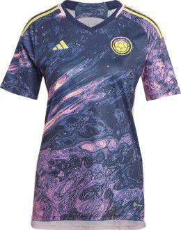
7- Colombia
The galaxy-inspired away kit is definitely appealing to anyone who went through an astronaut phase when they were a kid. Is it too much to say these kits are out of this world?
The home kits are mainly pastel yellow, which for those of you who remember the colour wheel back in art class, compliments the purple away jersey perfectly.
6- Jamaica
Jamaica is serving up some red-hot retro vibes.
The simplicity of the dusty yellow home kit with green stripes and the dark chocolate away kit.
What’s not to love?
5- New Zealand
The co-host have brought the heat with the kits.
The black home kit features a grey fern pattern, a tribute to the country’s silver fern. The plain white kits also feature a fern in the top left corner.
4- Nigeria
For their first official exclusive women’s kit, Nigeria have absolutely nailed it.
Their home kit is a vibrant green, which brings the energy Nigeria needs to make it all the way. The away kit has a retro video game feel to it on a deeper green shirt which complements the home kit nicely.
3- Canada
Now we’re getting serious. The maple leaf has had a revamp in this futuristic, geometric-inspired home kit. The red is vibrant, it’s bold, it’s everything.
The away kit is just as iconic, with Canada delivering a white polo with a daring red strip around the collar and sleeves. It definitely feels more retro-inspired than the home kit, which has a vibe.
But clearly, Canada is not here to mess around. They mean serious business.
2- Denmark
I am here for the creativity. I am here for the uniqueness. I am here for Denmark.
The home and away kits are inspired by pop art, with subtle stars, stripes and dots along the sides of the jerseys. The intuition is off the charts.
Also bonus points for releasing the jerseys alongside an epic pop art cartoon promo.
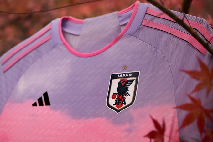
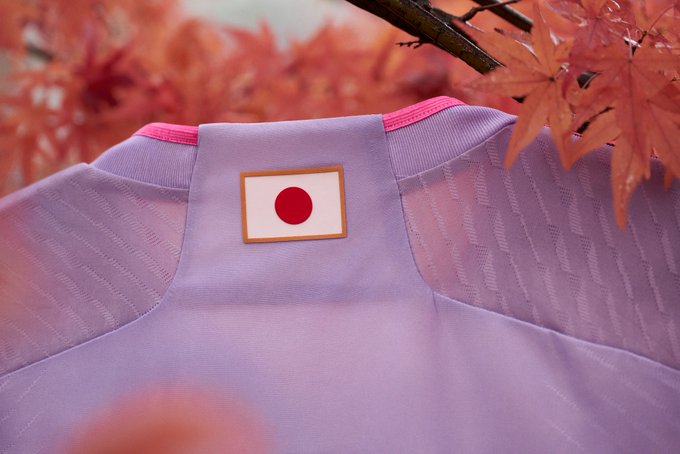
1- Japan
The blue geo-metric home kit. Amazing. Stunning.
The pastel pink and purple away kit. AMAZING. STUNNING. Inspired by the sunrise at Mount Fuji this kit is to die for.
The mix of the funky patterns on the home jersey and the cloudy vibes of the away creates an unforgettable kit.
Featured Image Credit: NikeTopics: FIFA Club World Cup, Football World Cup, Womens Football, Australia